
30+ tips and tricks to make Google Slides presentation look good
Home Blog 30+ tips and tricks to make Google Slides presentation look good

Let’s face it, it’s no fun to look at a slide with heavy texts and overcrowded images. It leaves the audience bored and disinterested. It’s very important for your Google Slides presentation to look good in order to have your audience on board. You don’t need to be a designer to learn how to make aesthetic google slides. You can make some basic editing and formatting easily in Google Slides presentation to take it to the next level. In this article, we present some amazing hacks to have a killer presentation that leaves the audience in awe.
Be prepared for a bonus at the end!
Use Google Slides layouts wisely
1. customize slide layouts.
Every presentation needs to follow a basic layout which is regular throughout. Google Slides have a set of layout and theme options to choose from. But in case you wish to edit certain elements, you are free to do it. This will make the presentation truly yours. Click here for a complete guide on using layouts any fresher can use.
2. Use pretty backgrounds for Google Slides
Most of the professional presentations contain a lot of jargon-heavy information written in plain texts on plain backgrounds. Instead, include a transparent or mild background to support your text. The background can either be related to the story or just a plain color wall that goes with the text font and the context.
3. Draw attention with dark background
Audience gets tired of looking at bright colors all day. So, using a dark background not only catches their attention, but is also pleasant for the eyes. But remember to use the matte finish or mild colors for text with the dark background.
4. Try black and white theme to look professional
Often, a black and white theme stands out both because of the professionalism it conveys. This keeps your presentation minimal in appearance and adds to the authenticity of your delivery. But you should be careful not to make it look boring.
5. Use the Master Slides tool
Any change you make in the master slide will automatically reflect on all other slides. Customize the master slide first so that you can save time. You can modify backgrounds, rearrange placeholders, or change theme for the whole presentation with Master slides tool.
6. Keep it minimal
Don’t go fancy with the designs and fonts, keep it minimal. Overcrowding the slides with bulky texts and images or vibrant colors is not a good idea. It will distract the audience and make the presentation look unprofessional.
How to make Google Slides look good with Images
1. use shape masks to make creative images.
Using regular shapes like square and rectangle for images can get boring. To make it interesting, give different shapes to the images.
How to use shape masks in Google Slides:
Select the image you want to apply a shape mask on. Crop the image to the size you want. In crop tool, go to Shapes and choose a shape from the drop-down menu.
2. How to import images from the web
Adding relevant and catchy images make your google slides aesthetic. But you may not have the perfect image to go with the slide. In that case, you can directly download the picture from Google without leaving the tab.
How to import Google images into Google Slides:
Go to Insert >> Image >> Search the web >> Type in the name of the image you want. Or, go to Explore section and Google directly from the Slides tab.
3. Reflect your images if it suits the context
This will be a really cool effect, especially for slides with a single important image. Reflecting your images is a creative way to grab the attention with a single slide. But, this is a bit outdated feature, so it’s better to avoid for professional presentations.
How to reflect an image in Google Slides:
Select an image. Go to Format options and tick the box next to Reflection. Use the slider to adjust the size and transparency.
4. Make the image transparent
Another tip is to adjust the transparency of your image rather than adding a plain image. Plus, you can write relevant text on top of a transparent image.
How to make an image transparent in Google Slides:
Right-click on the picture and go to Formats option. Go to Adjustments >> Transparency. Adjust the transparency as per your requirements.
5. Resize and rotate shapes and images
When you import an image from the web, it might not be the right size for your slides. Google Slides allows you to resize and rotate the images and shapes.
To resize a picture, simply select the picture and move the cursor to bring to the desired size. To rotate an image, click the picture and choose Arrange. Then, click Rotate and select the preferred orientation. Avoid these while using images in Google Slides presentation: Though there are a hundred things you can do to your image, overdoing it will beat the point of making your Google Slides presentation look good. Following are some of the things you should avoid so that the slides look professional.
Using blurry or irrelevant pictures. Stretching or cropping the image more than necessary Low resolution images Watermarked images Not adding citations while using a picture you don’t own Crowding the slides with pictures Using reflection or transparency settings in all the images
Make your Google Slides presentation interactive
1. use the interactive q&a tool.
Having a Q&A section at the end helps you clear any doubts your audience might have. You can make it more interesting by using the Q&A tool. The audience don’t have to wait till the end of the presentation, they can type in the question whenever they want.
How to use the Q&A tool:
During your presentation, activate the Q&A feature by clicking on the Q&A tool. Audience sees a weblink where they can submit their questions. You can answer them at the end of the presentation. You can check the past questions by going to Tools >> Q&A history
2. Create a timeline
In many business presentations, you might need to present the progress of a project and timeline is an important part of it. It is easy to understand and remember. This can be used for interactions and discussions with the audience.
How to create timeline in Google Slides:
Go to Insert >> Diagram This shows a list of different types of timeline templates in built with Google Slides. Choose the one you like and edit it for your data.
Color schemes for your Google Slides presentation
1. edit theme colors.
Every Google Slide theme you choose comes with a pre-set color scheme. However, you can customize the theme according to the color you prefer.
Go to Slide >> Edit Theme Choose a color from the drop-down menu. Here’s a guide on choosing the right color for your Google Slides presentation.
2. Use color split
Using two different colors on the same slide is visually appealing. Make sure you use complementary colors like yellow and blue. For example, if you are using a blue background, use orange color for the texts.
3. Create a color overlay
Color overlay is a technique to make transparent shapes appear on your images or text. You can either apply it to the whole slide or a part of it.
Go to Insert >> Shape Choose a shape if you want to overlay only a part of your slide. Place the selected shape on the slide. Click on the shape and go to Fill colors and choose the color you want. Avoid these while choosing colors for your Google Slides presentation: While adding colors in a smart way can grab the audience’s attention, there are certain rules you should stick to while using them. Here is a small list of things to avoid in order to make your Google Slides look good.
Using multiple bold colors in a single slide Using same color for theme and texts Not sticking to your brand colors Using bright colors for reflection of images or texts. Overusing color gradient
Tips for text in Google Slides presentation
1. try different font attributes.
No one is going to read all the text in your presentation. So, you can highlight the parts which you want to stress on. You can make the text bold, italics, or underlined.
2. Research the top text fonts to use in Google Slides
There are a number of text fonts available in Google Slides, but not all of them make it to a professional presentation deck. So, it’s very important to know the most preferred text fonts to use in Google Slides.
Here are the 5 top text fonts:
Open sans Montserrat Cabin Ubuntu Lato
3. Use text box to have neat texts
Texts randomly strewn across the slides can be distracting for your audience. So, use a text box to have the texts placed in a neat way. You can also align your texts to left, right or centered to make it look professional.
4. Add a drop shadow to the text
Another way to make your texts look interesting is to use a drop shadow effect for Google Slides. However, if you lack experience in designing, we suggest you not to use this effect.
How to add drop shadow:
Select the text you want to use drop shadow on. Go to Format and check the box near Drop Shadow. Use the slider to adjust blur, transparency, and angle.
5. Add the technical terms to your personal dictionary
There might be terminologies or names that are specific to your topic, which may come off as spelling errors. In slides, they may appear in red and you may lose your credibility. To remove this, you can add those terms to the personal dictionary.
Go to Tools >> Personal dictionary Add the technical terms. They will no longer be shown as spelling errors. Common mistakes people make in Google Slides text: While the above features can make your text professional and easy to read, most people miss out on the basics.
Omitting indentation Wrong alignment of text on the slide Using very large or very small texts Not proofreading for typos Inadequate spacing between texts or lines.
Include infographics in Google Slides presentation
1. experiment with different types of diagrams.
If you have a lot of data to present, it’s better to present as graphs or charts instead of pulling off large sheets of data. There are different types of graphs you can use like line graph, bar graph, histogram, pie chart, etc. So, use them in your presentation. This adds credibility to your work and presentation.
2. Let your graph speak for itself
This means you must label, highlight or add everything in the graph such that anyone can analyze it. A single graph with right labels and arrows to show the trend can convey the meaning much better than large amount of texts or spreadsheets.
Add animation to make Google Slides presentation attractive
1. add subtle animation effects on texts.
If you have a lot of information to share on a single slide, use animations to delay some texts instead of displaying everything at a time. This works well for bullet points where you can display one point after another.
2. Add a GIF or a meme
One of the main reasons why presentations are boring is the lack of fun element. Adding a GIF or a relatable meme is not only funny, but helps you put the message across easily. It is an effortless attention grabber.
But you have to make sure it gets added as an animated GIF rather than a still image. For this, the following steps will help:
Find the GIF in Google and copy the image address. Go to Google Slides >> Image >> by URL Paste the URL and click Insert. Remember you have to insert the image by URL for it to play.
3. Add trimmed videos in Google Slides
People recollect visuals better than written text. So, if there is a video on YouTube which can explain what you want to convey, use it. But instead of including the full video, you can add only the relevant part by using the embed option.
4. Use transitions for slides
Adding smooth transition effects for individual slides helps in keeping the flow. The most recommended transition effects to use in a professional presentation are dissolve, fade in, slide from the left, fly in from bottom and fly in from left to right.
Go to Insert >> Animation Select a transition from the available options. Apply to a single slide or all slides, as you wish.
Are you terrified by the amount of effort you have to put in researching about fonts, choosing best colors and get the formatting perfect? This can be time-consuming if you designing is not your biggest flex.
Don’t worry! Here’s the good news!!
You can skip all these steps and still have an amazing presentation deck if you use professional templates!
Use Google Slides presentation templates
Making a presentation from the scratch is wasted time and energy which could be spent on crafting the story you want to convey. That’s why we bring to you the best presentation templates to help you tell your story in your unique way. SlideKit has professional templates designed by experts and you can customize it according to your needs. This can be installed as an add-on in Google Slides for free. It ensures consistency of aspects like font, theme, color scheme and layout used throughout the deck.
SlideKit has slides in the business and other professional domains which you can download, edit and use for free. Premium membership gives you access to 3500+ templates over 35+ niches. Using these templates will make your Google Slides presentation stand out. Here are a few tips to make the most out of SlideKit’s professional google slides templates .
1. Customize the templates
The presentation deck you choose will have all the design and infographic elements you need; but you need to customize them according to your data and your preferred color and font. In SlideKit, you can add images, videos, or hyperlinks, and place them wherever you want on the slide. Additionally, you can acquire hyperlinks from other websites to your own which is referred as niche edits .
2. Use niche-specific templates
There are templates available for different domains, so choose the one that fits your industry. Templates are perfect for branding since they come with placeholders for logo, letterhead, contact details and website address. But it’s important to choose the one that is aligned with the industry. SlideKit makes it easier for you by giving you a variety of industry-specific options to choose from. Moreover, incorporating effective SEO strategies , such as optimizing presentation titles, using relevant keywords, and providing quality content, can significantly enhance the online visibility of your Google Slides presentations, making them more accessible to your target audience and boosting overall engagement.
3. Plug in your data to relevant infographics
As mentioned before, including graphs and charts is beneficial for both you and your audience. Depending on the domain, SlideKit offers relevant infographics which can be customized according to your data. You can change the labels, legends, scale and figures, among many other features.
Now you have the best resources and tools to make your Google Slides presentation look compelling.
Happy presenting!
Welcome Back!
Please sign in to continue.
Don't you have an account?

How To Make Google Slides Look Good [Complete 2024 Guide]
- Last updated January 2, 2024
Making a standard presentation is easy, but knowing how to make Google Slides look good is an entirely different challenge. In my guide, I will show you how to make your Google Slides better , both functionally and aesthetically.
Keep reading to learn how to take your Google Slides presentation from good to great !
Table of Contents
1. Choose a Google Slides Theme

Themes ensure your presentation has visually consistent colors, fonts, sizes, and layouts. This goes a long way toward providing a professional and polished appearance, and it’s much easier for the audience to follow along.
- Choose a theme that aligns with the tone and purpose of your presentation.
- Ensure slides have a consistent set of colors, fonts, and layouts.
- Select a visually appealing color scheme and legible font combination.
While you can handpick background color palettes, typefaces, and slide layouts, many of the best Google Slides templates are built into the program! In a blank presentation, you’ll find them on the right-hand side.

Creating Your Own Google Slides Theme
It’s fairly straightforward to create your theme in Slides. Add whatever background color, images, shapes, and page formatting you prefer. Right-click your chosen slide and select “ Add to theme .”

Related : Don’t want to make one from scratch? I’ve got you covered with some of my favorite Google Slides templates at the bottom of this article.
How To Import a Theme to Google Slides
- Create a new presentation or open an existing one.

Note : Importing a theme into your presentation will impact all of your slides. To revert to the previous version, use the “ Undo ” button by pressing the keyboard shortcut Ctrl + Z (on Windows) or use Command + Z (on Mac).
2. Choosing Color Schemes in Slides
A color scheme is one of the first things your audience will see, so it’s one of the most critical elements. Google Slides offers plenty of color options, including gradients (which can be used for almost all the elements, including background, font, and shapes).
Use color theory principles (like complementary colors) to create combinations that stand out for the right reason. Color psychology is also a great way to express emotions or convey messages purposefully:
- Warm colors (e.g., red, orange, yellow) can express warmth, energy, or even a warning.
- Cool colors (e.g., blue, green, purple) can represent relaxation, sophistication, or security.
Use Color to Make Sections Stand Out
Strategically use color to highlight essential elements (e.g., headings, critical data). To guide the audience’s attention:
- Use vibrant shades that contrast the color scheme.
- Assign specific colors to categories, sections, and team members.
Be Mindful of Contrast
Check that the text and background colors have enough contrast for better reading. The most readable combination is dark text on a light backdrop (or vice versa). In charts and graphs, use color to improve focus and understanding.
Note : Avoid colors that can blend together or present difficulties for people with color blindness .
3. Choosing Text and Fonts
Your chosen font portrays information and dramatically improves your presentation’s overall aesthetic. If you’re trying to make a cool presentation on Google Slides, you’ve got a lot to consider!
Use Clear, Legible, and Easy-to-Read Fonts
Avoid overly decorative or ornate fonts because they can hinder readability (especially when projected on a larger screen). Stick to widely available and compatible fonts across devices like Arial, Georgia, or Open Sans.
Ensure Font Sizes, Weights, and Styles Stand out
Headings should stand out; supporting text should be smaller (or less emphasized). This is done to guide the audience’s attention and improve readability.
Note : While they can add visual interest, excessive use of font styles can be distracting and more challenging to read.
Complement Font Pairings
Select a combination of fonts that contrast each other and create visual interest. Consider using online resources or font pairing tools for inspiration. We recommend sticking to a maximum of two to three fonts to prevent visual chaos.
Use Fonts That Align with Branding Guidelines
If your website uses a specific font and color scheme, incorporate them into your presentations to support the organization’s visual identity.
Align Text and Spacing
Align text and leave enough white space for a clean, organized look.
4. How to Add Word Art to Google Slides:
- Select “ Insert ” > “ Word Art ” from the drop-down menu.

- Type your text, then press the “ Enter ” key on your keyboard.

There you have it! Your Word Art will now appear on your selected slide.

Note: If you want to edit the font or color, click the Word Art, and a formatting box will pop up.

5. How To Add Google Slides Transitions
You can ensure seamless transitions from slide to slide with a couple of clicks:

- If you want to apply the selected transition to all slides in your presentation, click “ Apply to All Slides .”
- Any transitions applied to skipped slides won’t play during the preview.
- Click the “ Stop ” button when you’re finished.

Tip : You can configure your presentation to play automatically using Google Slides’ automatic transitions. This removes the need to press the spacebar or click on the screen to trigger the next slide.
How Many Transitions Are Available in Google Slides?
At the time of writing, Google Slides offers seven built-in transitions . There is currently no option to add or download additional transitions.
6. How To Add Animations on Google Slides
Enhance the visual appeal of your slideshow by incorporating animations (i.e., effects that make elements move). They can be applied to almost every object, from images to tables to bullet points. Follow the steps below to add animations to your slides:

- You’ll notice that your selected object’s “ Animation Type ” is set to “ Appear .”

- Fade in : This transition introduces the object by gradually fading it in.

- Fly in from left/right or top/bottom : The object flies into the slide from one side.

- Zoom in : The object starts small and slowly increases in size.
Under “ Animation Type ,” you’ll see the “ Start Condition ” drop-down. Open it to select whether the animation should play upon clicking a slide, with the previous animation, or after the previous animation.

Note: The start conditions “With Previous” and “After Previous” will only work if there is another animated object immediately before your selected object .

- Click on the “ Play ” button to preview your animation(s).
- Click the “ Stop ” button to end the preview and continue working on your slideshow.
Related : Google Slides vs. PowerPoint: Which Program Is Better?
Tips for Using Transitions & Animations
We recommend using these effects sparingly to emphasize essential elements or facilitate the flow of information. Avoid using them solely for decorative purposes.
Pick Subtle and Smooth Transitions
Flashy or distracting effects can overshadow your content. Your goal is to provide a seamless flow between slides. Try a simple fade or slide transition.
Adjust the Timing and Duration
Transitions shouldn’t be too fast or slow. Aim for a natural pace that allows the audience to follow along comfortably.
Highlight Specific Elements Within a Slide
Selectively animating text, images, or charts can emphasize critical points (or reveal information) in a controlled manner. Avoid excessive animation that appears gimmicky or distracting.
Be Consistent
Choose a specific transition style or animation effect — then stick to it. This will help you avoid distractions and inconsistencies.
7. Using Images and Videos

Adding images and videos to slides can greatly enhance visual appeal and engage your audience. Here are some points to consider when choosing an image:
- Choose images that are relevant to your content.
- Use high-quality images that are clear, crisp, and well-composed.
- Use images that evoke emotions or illustrate concepts.
- Strike a balance between text and images on your slides.
- Consider using images as slide backgrounds.
- Adjust transparency or apply overlays to maintain readability.
- Experiment with image formatting options (e.g., cropping, resizing, transparency, brightness).
8. How To Include Infographics in Google Slides

Infographics in a presentation can communicate complex information effectively. Use the drawing feature in Google Slides to make attractive and informative infographics. Keep these points in mind when using infographics:
- Keep your infographics clean and basic.
- Choose from bar charts, pie charts, line graphs, timelines, flowcharts, maps, and diagrams.
- Avoid overwhelming your audience: Use limited details, succinct labeling, and clear graphics.
- Use custom colors, typefaces, and visual styles to reflect your presentation or company identity.
- Highlight the most significant facts or data.
- Make sure infographic details are simple to read and understand.
How Can Poor Design Affect A Presentation?
Your presentation could be significantly impacted if you haven’t learned how to make Google Slides look professional. Here’s why:
Lack of Clarity
Poor aesthetics often make it more difficult for the audience to grasp — or focus on — details. Avoid cluttered or crowded presentations, imprecise typefaces, and insufficient color contrast. Key points might be missed, or the audience may get distracted.
Unprofessionalism
A disorganized presentation might give the appearance of being unprofessional, affecting the presenter’s credibility.
Poor Readability
Small fonts, poor contrast, and ornamental typefaces can strain the eyes and make it difficult to follow a presentation.
Lack of Visual Appeal
A presentation with a dull or unappealing design may fail to catch attention (and make the material less memorable).
9. A Few of My Favorite Google Slides Templates
If you’re not interested in using stock templates (let alone creating your own), I’ve got you covered with these slick presentations:
Ganymede Template

The Ganymede template offers a modern style with bold text for extra impact. Whether you aim to make a lasting impression with your pitch deck — or simply want to use colors that align with your brand — this template suits your needs.
Access Template
Dynamic Business Template

An effective project management report is characterized by clarity, and your color scheme plays a significant role. I love the streamlined theme of this Google Slides template and appreciate that a blank timeline chart, roadmap diagram, and funnel are included for incredible customization.
Frequently Asked Questions
Can you make google slides vertical.
You can make Google Slides vertical by following simple steps:
- Open a new or existing presentation.
- Click the “ File ” button to open a drop-down menu.
- Click the “ Page setup ” option.
- Select the “ Custom ” option and set your desired size (width and height)
- Hit “ Apply ” to save the changes.
Can You Do Hanging Indent in Google Slides?
Yes. There are three methods to do hanging indent in Google Slides:
- The ruler (blur triangle) along the top to position your hanging indent.
- The keyboard Tab key for quick indentation adjustments.
- Select “ Text Fitting ”> “ Indention ” > “ Hanging ” > “ First line indent ” > “ Hanging indent ” to the desired amount.
Are There More Google Slides Templates?
Yes. There are many free Google Slides templates out there. Here are ten additional templates for you to use.
Bottom Line
Any presentation’s goal is to keep the audience’s attention, and you can do that with a balance between aesthetics and practicality.
I hope I’ve helped you learn how to make your Google Slides look good, express your message, and captivate your audience. If you need more assistance, Spreadsheet Point’s premium Google Slides templates can take the pressure off you. When you use the code SSP, you’ll get 50% off !
Get Premium Templates
- How To Download Google Slides [Step-by-Step Guide]
- How To Add Bitmoji to Google Slides
- How To Make Google Slides Play Automatically
Most Popular Posts

How To Highlight Duplicates in Google Sheets

How to Make Multiple Selection in Drop-down Lists in Google Sheets

Google Sheets Currency Conversion: The Easy Method
A 2024 guide to google sheets date picker, related posts.
- Sumit Bansal
- May 16, 2024
- May 2, 2024
How to Insert a Google Sheets Hyperlink in 5 Seconds
- Chris Daniel
- April 15, 2024
How to Import Stock Prices into Google Sheets
- April 2, 2024
Thanks for visiting! We’re happy to answer your spreadsheet questions. We specialize in formulas for Google Sheets, our own spreadsheet templates, and time-saving Excel tips.
Note that we’re supported by our audience. When you purchase through links on our site, we may earn commission at no extra cost to you.
Like what we do? Share this article!
How to Make Google Slides Look Good And Add a Touch of Finesse?
- Share on Facebook
- Share on Twitter
By Nikolay Kaloyanov
in How-To Tutorials
2 years ago
Viewed 25,724 times
Spread the word about this article:

From ancient times to today, people have been obsessed with beauty. People have adored art, whether we talk about cave drawings or Renaissance art. Our nature has remained the same – only the means have changed.
Regardless of the presentation software you use, a top-notch performance is about three key details: a confident speaker, helpful content, and great design. And while many people aim to add tons of information and become exceptional orators, many presenters overlook visual elements for some reason.
In this article, we will see how to make Google Slides look good and what is the benefit of adding design elements.
Article overview:
1. Why should you make your Google Slides visually appealing 2. What are the benefits of stunning Google Slides presentations? 3. How to Make Google Slides Look Good?
1. How can poor design affect your presentation?
Your audience is exposed to a lot of information daily – news, social media feeds, videos, chats, etc. A brain has been so used to receiving lots of info daily that it filters out most of it. At the end of each day, you remember the brightest moments.
The same thing applies to presentations. If you have spent much effort delivering your presentation, you win points, and your idea might get “sold.” However, it would help if you had that extra bit of something – like a pinch of salt, to make the difference between a good presentation and an outstanding one.
Visually appearing presentations can have a profound effect on your audience. Imagine seeing the same person in the subway – on day one they wear an old jacket and dirty jeans, and they are dressed up a day later. If they come to you, asking for a small favor – when will you trust them more?
2. What are the benefits of stunning Google Slides presentations?
Whether you are a teacher, student, or business person, you want valid reasons to add graphic elements to your presentation. Modifying the themes in Google Slides , inserting shapes, and creating animations are all time-consuming. A couple of minutes here and there, and you have already spent hours on the presentation. But how do you compensate for this time? Let’s see what is the added value from making your Google Slides presentation more attractive.
✅ A better understanding of your concept – Google Slides presentations have a main topic and sub-topics. If you organize your slides and make them more appealing, it will be easier for your audience to understand what you’re saying.
✅ Data visualization – in most presentations, the main focus is on 2-3 slides that contain data. Proper data visualization can convince your audience and sell your ideas.
✅ More confidence – just like formal clothes, good-looking presentations give that extra confidence in speakers required to perform more assertively.
✅ Improved conversions – while the term “conversion” might create associations with sales, it doesn’t have that purpose only. While for salespeople good presentation design could result in more products/services sold – students might convince their teachers they deserve an A+, and professors could keep their students hooked during the whole lecture.
3. How to Make Google Slides Look Good?
Google Slides offers a lot of functions that could be utilized to make your presentation look better. Below, you can find eight tips and tricks to improve your design and grab the audience.
3.1. Use presentation templates
Time is money. While you can optimize your presentation design every single time you create a new presentation, it is extremely time-wasting. Doing the same thing over and over again is not a viable strategy. This is where templates come into place. Instead of doing everything from scratch, you have a ready-made backbone, and your task is to enter your content and tweak the template a little bit, depending on the presentation.
Google Slides comes with 20+ default templates to choose from. You can then edit the colors from the Theme builder but that’s about it. You also have the option to customize each slide individually but remember – you should keep the consistency with the colors and the structure of the slide.
The last option is preferred by many. Instead of using a generic template, you can download a pre-made template mixed with some tweaks. There are plenty of free Google Slides templates. Of course, you can also buy paid templates which can be extremely useful if you carry out presentations frequently.
But no matter which ones you download – the paid or the free templates, you should know that they have been created by designers, so you should only change minor details. There’s no need to worry about font compatibility, color contrast, and other details which would otherwise be hard to manage.
3.2. Choose the right colors

The Color Theory is applicable in any area of our lives. Your Google Slides presentation makes no difference. Depending on the topic you are presenting, you need to select your colors carefully. If you offer a banking product, you might want to use light blue background combined with red and white. For presentations about nature and biology, using green and brown as more earthy colors will be a good idea.
Don’t forget to play with the font colors, too. For presentations with darker backgrounds, fonts have to be light and have bright accents. If you have a very light background, you have to make your text darker and bolder.
Colors are a substantial part of branding. If you have a Google Slides presentation and you want to showcase your branded goods, you might want to use the brand colors, as to highlight your product and add more value to it.
3.3. Pay attention to fonts

The fonts you pick will set the tone of your presentation. There are many things to consider when adding fonts. Make sure your topic matches the seriousness of the fonts – for more formal presentations (like medical presentations), you have to use more formal fonts – like Roboto, Arial, Helvetica Neue, and Garamond. You can easily add some of the best free fonts to your Google Slides presentation .
You need to focus on one critical detail, though – it’s not a good idea to use more than 2-3 fonts in your presentation. If you break this rule, you risk distracting your audience. Also, you need to be consistent with your choice of fonts – picking fonts that are either too similar (lack of visual hierarchy) or too different is a big blunder.
A quick tip : If you don’t know which fonts to choose, you can select fonts from the same family or combine one serif for the title text and a sans-serif for the standard text.
3.4. Add transitions

Knowing how to make Google Slides look good is important. So are the transitions. Finding the right balance between adding too much and having none is fundamental. Also, try to use a maximum of 1 transition per slide. It’s a good practice to set the same effect on all slides, as to keep consistency.
It will not be a bad idea if you avoid using Cube and Gallery transitions. They are a bit too overwhelming. You can also use object animations. They are quite useful if you have an important chart to show, as they can attract your audience’s attention.
3.5. Use infographics

Infographics (a combination of information + graphics) are a great way to make data more accessible to your audience. They are visual representations of necessary facts you would like to share with your audience and are a much-preferred way to present information more clearly.
Instead of explaining the details and having a slide with two long paragraphs where people get lost, creating a simple radial chart in Google Slides and displaying it in front of the others, for example, might better convey your message.
But infographics are not limited to charts. You can display all types of data – process steps, historical values, etc. Ensure you have the right infographic for your information. If you discuss the project scope, you might want to visualize it with a Gantt chart or step-by-step infographic. A pie helps show a percentage of the whole. And be careful – even if you come up with a good infographic design, you need to create a legend so that people can understand it.
If you need infographics, you can check our collection of 500+ infographics compatible with Google Slides (including freebies).
3.6 Embed videos

In one of our previous guides, we showed you how to embed videos in Google Slides . Both Millennial and Gen Z audiences consume a lot of video content. As a result, you can create a lasting impression on them by adding useful videos to your topic. The good news is you can edit the videos, so they can watch the part which is most relevant to the slide topic. It’s not a good idea to stream more than 2 minutes per slide, as you will lose your impact as a speaker. Also, don’t show more than 3 videos per presentation, as videos aim to support you, rather than be the main source of content.
As both YouTube and Slides are part of Google, it’s elementary to add videos from the video streaming platform directly. If, however, your want to add videos that aren’t uploaded on YouTube, you simply have to download them (Vimeo has such an option) and implement them through Google Drive.
3.7. Add GIFs
GIFs are the perfect mix between single-frame images and videos. With them, you can catch your audience’s attention on particular details from your presentation. GIFs are one of the cool things you can do with Google Slides. Since a GIF is practically an image, you can add them easily – by URL or from your computer. You can check one of our articles about free GIFs for presentations .
GIFs find great application in pinpointing certain phrases or infographics that readers should pay attention to. You can also create a GIF to make a demo of how something works, so it can be utilized in tutorials. But GIFs should be used moderately. Abusing these visuals will result in diminishing returns – the audience will get distracted and the GIFs won’t be able to fulfill their goal.
Regarding memes, you’d better not use them. While a positive impact is possible, the chances are that you will most probably make your presentation less serious and change the topic of the whole presentation.
3.8. Add 3D shapes

Design is design – whether we speak about presentation design or UX design. Making your Google slides aesthetic brings a lot of added value but you should know that trends are changing, and coming up with dated designs will not make a good impression. And speaking of trends – 3D shapes are an inevitable part of modern design, a 3D image might be more relevant and easily understood than a simple 2D drawing, especially if the presentation is about architecture and engineering.
Currently, Google Slides doesn’t have its own 3D shapes and charts, but you can easily add one from external sources – you can use your computer (if you have it there), a URL address, or if the image is shared with you in Google Drive.
You should learn how to make Google Slides look good, as your audience is demanding – people want to hear someone who is confident in presenting something which is visually attractive. If you manage to use Google Slides to your advantage, you can come up with outstanding presentation designs and enjoy the deserved applause at the end.
If you found our post useful, you can also take a look at our collection of Google Slides tutorials , or browse some of these:
- How to Calm Down Before a Presentation: 10 Practical Tips and Techniques
- How to Start and End a Presentation: 10 Practical Tips to Grab Attention and Make an Impact
- 20 Google Slides Tips to spice up your Presentations

Add some character to your visuals
Cartoon Characters, Design Bundles, Illustrations, Backgrounds and more...
Like us on Facebook
Subscribe to our newsletter
Be the first to know what’s new in the world of graphic design and illustrations.
- [email protected]
Browse High Quality Vector Graphics
E.g.: businessman, lion, girl…
Related Articles
How to create vector watercolor texture and elements in adobe illustrator, character animator tutorials part 2: basic puppet in illustrator, character animator tutorials part 4: rigging and tools, how to create a radial chart in google slides and visualize data, how to add audio to google slides and make your presentation awesome, 500+ free and paid infographic templates compatible with google slides:, enjoyed this article.
Don’t forget to share!
- Comments (0)
Nikolay Kaloyanov
Nikolay is a copywriter with vast experience in Technology, Marketing, and Design. When he isn't playing with words and crafting texts, he watches sports and asks questions. He is a funny person...until you put him on a diet.

Thousands of vector graphics for your projects.
Hey! You made it all the way to the bottom!
Here are some other articles we think you may like:

How-To Tutorials
How to make cartoon animation like ted-ed.
by Lyudmil Enchev

15 PowerPoint Tutorials to Help You Master PowerPoint
by Iveta Pavlova

How to Create a Custom Business Card Like a Professional [Tutorials]
Looking for design bundles or cartoon characters.
A source of high-quality vector graphics offering a huge variety of premade character designs, graphic design bundles, Adobe Character Animator puppets, and more.
15 Tips to Make an Amazing Google Slides Presentation Design!
By: Author Shrot Katewa

There are many reasons that people like to use Google Slides. It could be for a school project, work presentation or just to share information with friends and family.
Whatever the reason, one thing is certain: you want your design to look amazing! If you want an easy way to create a great-looking design for your next presentation then this blog post is for you.
In this article, we will go over 15 tips on how to make an amazing design using Google Slides. Whether it’s your first time creating a presentation on Google Slides or if you’re an experienced professional, these tips are sure to help guide you in the right direction!
So, let’s get started!
Note – if you are strapped for time , simply considering outsourcing the presentation design process to a professional! I’d recommend using Fiverr . It is completely hassle-free to set up and start using. Plus, you don’t need to pay anything to hire a professional. You only pay for the slide design! And, you can start with as little as $5 to $10 per slide!
Tips to Make an Amazing Google Slide Presentation Design!
Since this is going to be an action-packed article with a ton of suggestions, let’s just dive right in with the tips!
1. Create a Compeling Narrative Through a Story Arc
A presentation is only as good as the narrative it holds!
If your presentation doesn’t leave “ food for thought ” for your audience, they are less likely to remember your presentation, and even less likely to take any action afterward (which is mostly bad news especially if you are trying to convince your investors to give you more money!)
Presentation design goes hand-in-hand with the content that is going to be used for the presentation. Thus, start with a compelling story.
The best way to create a convincing story for your presentation is to use the “ Story Arc “.
A “ Story Arc ” or a “Narrative Arc” is something that has been successfully used by storytellers and writers for ages. The keyword here is “successfully”!
A powerful narrative can not only help your audience understand the intricacies of the subject of the presentation, but it also makes the presentation engaging and entertaining.
The best way to start working on a story arc is to either look at what is the most important aspect of your presentation and how can it be emphasized in a manner that takes the role of a protagonist?
Another way that I’ve used the story arc in my presentations successfully is to work backward. Think of what is the end outcome that you expect, and try to track things backward in order to achieve the end outcome.
No matter what approach you take, if you are able to fit a story arc in your presentation, you’d be golden!
Finally use stories from your life, or what you experienced while working on a project! I’ve seen this works really well and resonates with the audience. Here’s a quick video on tips for using storytelling in your presentation.
2. One Topic Per Slide
Now that you’ve identified the larger part of what you going to cover in your presentation – in other words, the content, you now need to lay it out on your presentation such that it can be consumed by your audience comfortably!
One of the simplest tips to design a better presentation is to make sure that you don’t cramp all the information in a single slide or 4-5 slides! Make sure that you spread out the presentation on multiple slides so that the audience can absorb all the information, but in short bursts, and then move on to the next topic!
A good rule of thumb for a good design is to try and cover just 1 topic on a slide.
I’ve seen this work plenty of times, and I personally also use this technique for my presentations. Simply divide the content of your presentations first into multiple key sections. Then, divide the sections further into key topics that should be covered within that section.
You can do this activity on a sheet of paper or just on the first slide of the presentation. Once you’re done with this activity, you’ll realize that the outline that you’ve just created also serves as the “Agenda” or the “Table of Contents” slide.
Now, all you’re left to do is fill in the information that needs to go under each topic.
You may be wondering how is this a design tip. Well, when you have just one concept present on a slide, it is not only easier for your audience to consume, but also easier to design. You’ll realize this when designing the presentation and thank me later!
Remember, there will be times when you will not have much to say about a particular topic, your slide will look empty, and you will be tempted to add another topic on the same slide. Don’t fall for that. Instead, use images that accentuate the text or the topic of the slide.
3. Start with a Template (Don’t Design from Scratch!)
This next tip might seem a bit obvious to some.
But, the reality is that quite a lot of people tend to miss out on the fact that you can use presentations that already look good, and just customize the slides for your content!
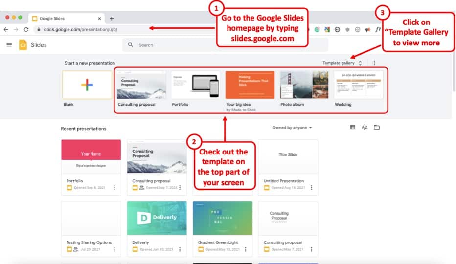
Google Slides already provides you with a number of free templates. Here’s how you can access them –
- First, visit your Google Slides dashboard page.
- Login to your Google Account (if prompted)
- Choose a template from “Start a new presentation” section
- You can also click on “Template Gallery” to view more templates.
The one template that I end up using over and over again is the file name “ Consulting Proposal “. It has got a sleek modern design, a good mix of image slides as well as different text placeholder slide layouts for you to easily edit your presentation.
But, feel free to check out other templates and see which one fits your need the best.
The point here is that if you are not great at designing a presentation, you’d perhaps be better off using a template rather than starting from scratch!
4. Use Fonts the Right Way
When it comes to designing a good presentation on Google Slides (or any application for that matter), fonts do play a key role in how your presentation looks!
Thus, it is important to make sure that you use the fonts correctly when creating your presentation.
Here’s what you need to remember when using fonts for your presentation –
- Use Just One or Two Fonts – Don’t use too many fonts in your presentation. Your presentation design will not look good. Plus, using too many fonts in a presentation shows lack of consistency and professionalism in design.
- Combine Fonts – Ideally, just use one font if you are unsure of which fonts work great together. But, you can also combine fonts to make the content of your presentation standout!
If you do want to go with a two-font option, use the Google Fonts tool to identify the font combination.
Here’s how you can find a good font combination for your presentation –
Step 1 – Visit Googe Fonts and Search for a Font
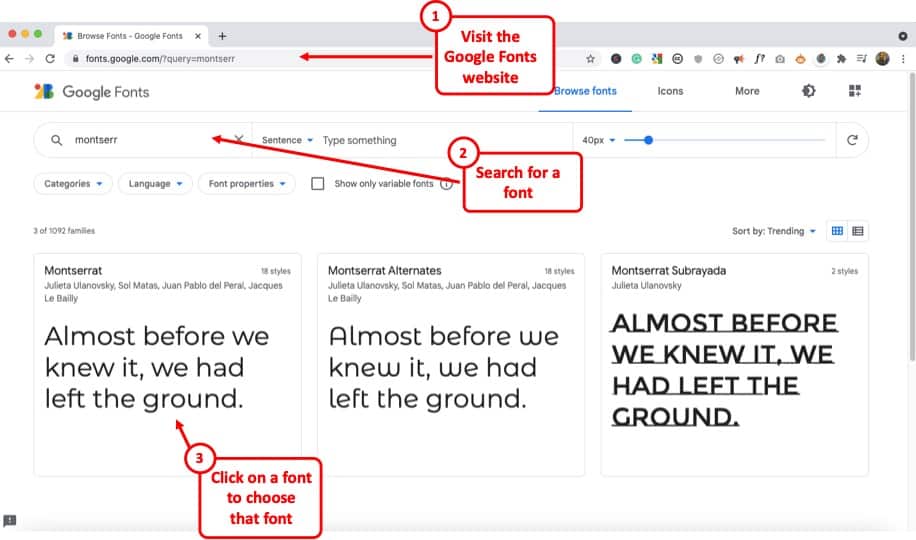
Google Fonts site provides free fonts that are compatible with most modern internet sites and web browsers. Google Fonts are considered the gold standard for sites as these look very modern and are light.
The best thing is – most of them are already available in your Google Slides presentation by default.
So, the first step is to visit the Google Fonts website . Then, search for a font, to begin with. My favorite font is Montserrat . But, you can also go with Lato, Roboto, or Source Sans Pro if you are looking for a Sans Serif Font .
If you are looking for a Serif font , I would recommend using Merriweather .
Step 2 – Choose the Font and click “Pairings”
The next step is to choose a font. You can either type one of the fonts that I mentioned in the search bar and click on it once it appears OR you can also simply choose from the list provided below.
Just make sure that you click on the font that you like to open it.
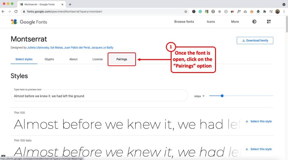
Once the font is open, click on the “Pairings” tab on the top (as shown in the image).
Step 3 – Choose a Font Pair
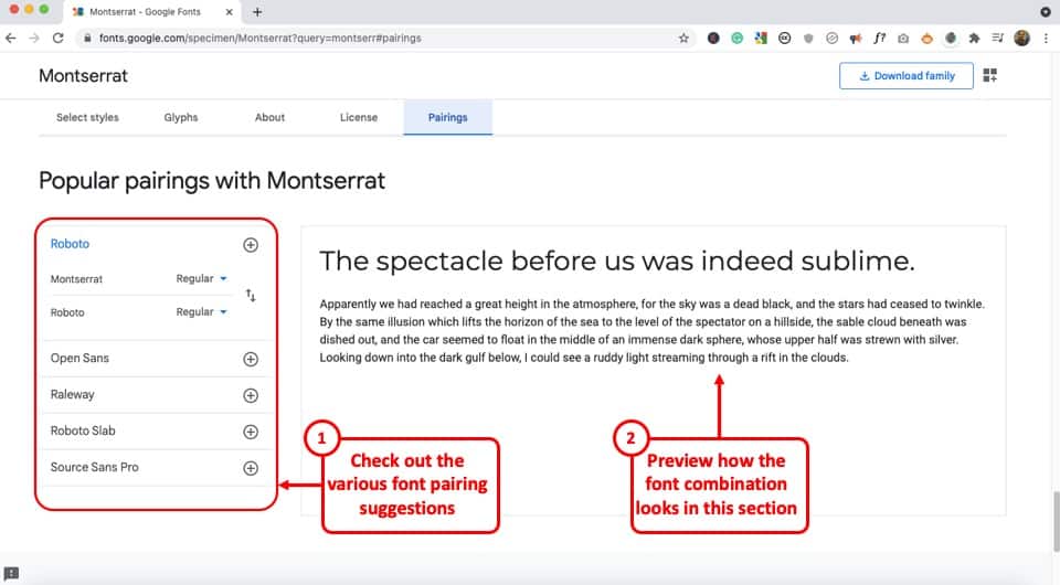
Now simply choose one of the font pairs provided by Google Fonts. You can also click on a font pair to see how it looks on the section on the right.
Play with the options provided and choose the font combination that you like.
Now, simply go back to your Google Slides presentation and change the fonts according to your selection.
5. Choose the Right Color Combination
Just the way fonts are an important part of your Google Slides presentation design, choosing a good color combination can make your presentation look visually appealing, consistent, and professional.
Unfortunately, a lot of struggle with choosing a good color combination. Thus, I highly advise going with a monochromatic color scheme.
A monochromatic color scheme in a presentation provides a variety of color combinations of the same color. This makes your presentation look consistent and professional.
Moreover, using a monochromatic color scheme is a perfect way option for a beginner as it requires the least amount of time and effort to set up!
Check out my other article on using a monochromatic color scheme for presentations to understand the topic in-depth.
Then, also check out how to use the eyedropper tool in Google Slides to implement the color scheme that you end up choosing.
Make sure that you change the color at the theme level in Google Slides instead of changing it on every single slide. This will save you quite a bit of time!
6. Use the Expore Tool to Generate Slide Designs
Once you’ve decided the fonts, color scheme, and theme, and you have the content structured out, you’ve done most of the hard work!
All you are now left to do is create the slide designs. And, to help you with that, make sure that you use the “ Explore Tool ” in Google Slides.
The “Explore” feature in Google Slides generates slide designs based on the content that is already present on the slide. It is a great way to get a slide designed almost instantaneously!
The “Explore” feature in Google Slides works much as the design ideas feature in PowerPoint.
Based on the content on the slide, it will throw a few suggestions on how the content can be laid out on the slide. You can choose the design you like. If not, you can still design your own slide. But, it is definitely worth trying out first. Pretty cool, isn’t it!
I wrote a detailed article on the Explore Feature in Google Slides . Make sure you check out that article to learn where to find this tool and know how to use it!
That said, one thing to keep in mind is that this feature is still an experimental tool . And, while it is getting better with time, I wouldn’t recommend using it with every single slide.
In my experience, I’ve noticed that using the “Explore” feature in Google Slides works best when you want to create a title slide, a section break slide, or just want to get a few ideas on how the slide can be designed.
7. Apply the 3 by 3 Design Rule
The 3 by 3 design rule, otherwise also known as “ the rule of thirds “, is a principle that has been borrowed from photography. But, it is every bit applicable even for slide designs and other design elements!
As per the 3 by 3 design principle, you basically need to divide the visual canvas into 3 equal-sized vertical and horizontal grids with the help of 2 vertical grid lines and 2 horizontal grid lines.
Here’s a video that explains the concept of the rule of thirds for presentations –
Using these grids helps place the content correctly in the grids such that the key message usually aligns with the way our eyes like to see them visually!
The 3 by 3 design principle may seem confusing at first, but once you’ve understood how to use it, you can literally take your presentation design skills a few notches above the rest!
Using 3X3 Grids to Properly Layout Content on your Slides
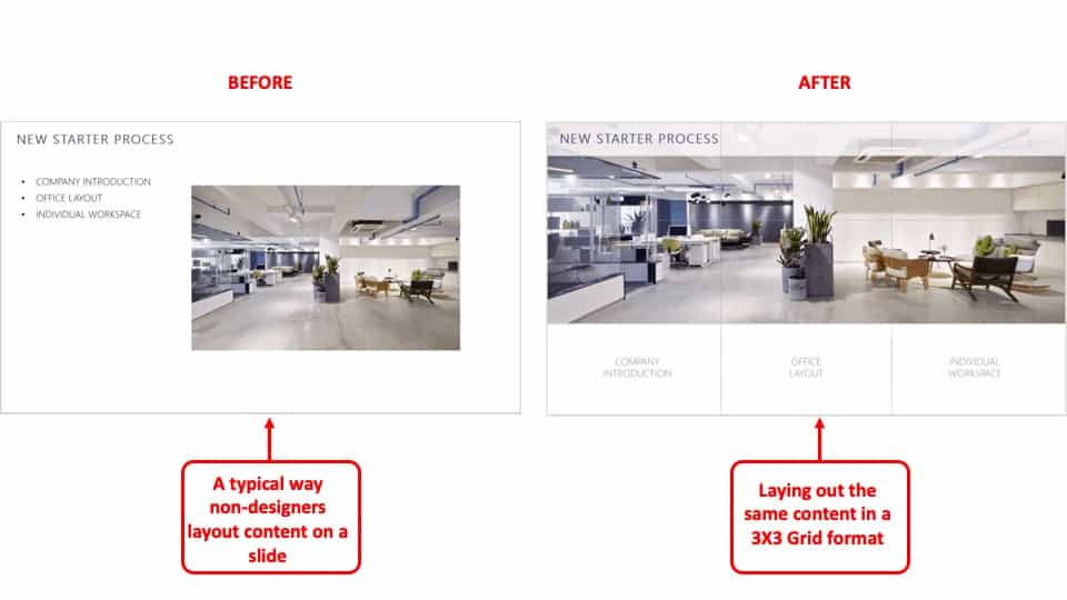
The interesting thing is, you can take the same principle to make it work with elements apart from the images that are present on your slide. And, the results are just amazing!
The picture above shows how most people design their slides (on the left). However, you can literally transform the way your slides look by applying the concept of 3×3 grids to any existing content on the slides! (as shown on the right part of the picture above)
Here’s another video that explains how this concept of 3 by 3 grids can be used to take any existing slides and make them better (if they aren’t properly organized).
8. Use Powerful Images
They say – “An image speaks a thousand words!”. This absolutely holds true when it comes to big impact presentation!
If you recollect any one of the top presentations from Steve Jobs. His presentation was almost always using powerful images with very few words on them.
Using images, as opposed to a lot of text, on your presentation has a few advantages of its own –
- Visual Appeal – Using images makes the slide visually appealing. Think about it – if there aren’t too many objects placed on the slide, the chances of making design related mistakes are also far lower!
- Emotional Connect – Using images creates a subtle emotional connect in the minds of the audience with the topic of the presentation and/or the presenter.
- Audience Focus – When you use text on a presentation, often the audience just reads the text and doens’t want to listen to the presenter. Instead, when using the images, you control the focus of the attention of your audience. Once you have their attention, making a presentation impactful is a lot easier!
- Faster Design Process – In most cases, it is faster to find an image and add it to the presentation rather than think of a way to design a slide to communicate a concept. This is especially true if you have only basic design skills.
If you watch some of the most famous TED or TEDx presentations ( know the difference between TED and TEDx presentations here ), it is quite common to see presenters using high-impact images with text. Ever wonder why is it so?
Well, one of the most important reasons is that you are able to control the attention of the audience!
Now, if you are wondering how to find images for your presentation, keep reading as I’ve got some great recommendations for add-ons later in the article!
9. Keep the Text on the Slide Readable
If using images for most slides is not the way for you, then this section is going to be quite important!
In fact, even if you do plan to use just images on your slides, there may still be a few slides where you will need to have some text. If so, make sure that the text on the slide is readable!
Make sure that you don’t use text that is too small to read.
As a general rule – the further the audience is going to be away from the screen, the larger the size of the text!
Here’s what to remember for the size of the text on the slides –
- Presentation seen on a computer screen – If the presentation that you are designing is going to be seen on a computer screen (either over an email or a zoom call), then make sure that the font size used for the presentation is not less than 16 points .
- Presentation seen on a large screen – If the presentation is going to be delivered in an auditorium, then it is recommended to use a font size no less than 30 points . For the rest of the situations, anything in between should be fine!
Also, make sure that you don’t use too much text on the same slide. Remember – you only need to cover one key topic on one slide.
It is totally okay to just use one word in the middle of the slide, and talk about that topic rather than using text from a complete word document on a slide!
If your audience will have to squint to read what is written, it just creates a bad user experience and they quickly lose interest.
Also, for the above reason, don’t include everything on the slide that you plan to say! If you do so, you may come across as a person who is just reading from the slide! Most importantly, the audience is going to end up reading the text from the slide faster than you speak, and end up losing interest in the presentation!
10. Ditch the Bullet Points (Use Infographics Instead!)
Using bullet points on a presentation is so 1990s! It’s just not the way good presentations are given anymore!
If you want your presentation design to look good, make sure that you get rid of bullet points. Instead, you can either use images, icons, or even infographics!
I’ve written an entire article on how to use infographics in Google Slides where I also talk about SmartArt and charts in Google Slides. Make sure you check out that article!
There are a ton of different ways in which you get infographics for Google Slides. I’ve talked about that also in the same article that I’ve linked above.
Likewise, you can also use icons instead of bullet points. Although adding icons to Google Slides is not an option that is available by default, there are a few ways you can work around this problem. For instance, you can use an add-on like “Flaticon” that provides free icons for Google Slides!
If you are wondering how to create a slide with bullet points and use icons or other methods, here’s a good example of an actual client slide that I redesigned –
As you can see on the image, simply using icons and structuring the text to give proper hierarchy to the information can make all the difference to the design of the slide!
In case you don’t want to use icons, you can also use numbers with circles, and use a similar design instead of just adding bullets to your presentation. If you do so, your presentation will still look good!
11. Avoid Using Just Table or a Graph
The next tip to remember is to avoid using just a table or a graph on a slide. Make sure that you also include a few points that act as key takeaways from the information that you provide.
Using just a table will present a lot of information on a single slide. This will definitely cause an information overload. And, even though your audience may be able to assess what is being presented to them, it is important to either highlight key pieces of information in the table or a graph.
Alternatively, you can also add a couple of lines of text indicating the key learnings from the data set.
Don’t get me wrong, it is important to have data sets on a presentation if you have one! But, just make sure that you also highlight key pieces of information that your audience should pay attention to.
12. Keep Animations and Transitions Subtle
Another design tip that you should keep in mind is the use of animations and transitions in Google Slides.
You want to make sure when using animations in Google Slides , you don’t add any funny movements. Think old school when using animations and transitions in your presentation.
Any additional movement or sudden transitions can distract the attention of the audience from the core topic and the messaging of the presentation.
So, make sure that you keep the use of such animations or transitions to the minimal!
13. Use Professional Google Slides Templates
If you find that the free template doesn’t have enough slide layouts for your presentation or doesn’t really fit the topic of your presentation, you may want to consider using professional templates!
There are a ton of different ways you can get templates for Google Slides. Unfortunately, most of the free options (and even most paid options) have outdated designs!
My personal favorite method for getting amazing Google Slides presentation templates is using Envato Elements .
The best part about using Envato Elements is that not only does it provide you with the best-in-class designs for your templates, but it also provides you with an option to download an unlimited number of presentations! (yes, you hear that right!)
Moreover, the pricing of Envato Elements is also really affordable! All you need to do is click on Envato Elements to visit the website, view the templates, and click on the “ Get Unlimited Downloads ” button on the top.
You will be prompted to sign up and pay a subscription. Just go for a monthly subscription and pay for one month (You can easily remove the payment method and cancel your subscription anytime).
Once you’ve logged in, simply cancel your subscription. Your subscription will be valid until the next date of renewal even if you cancel it.
Now, for the one month that you’ve paid, feel free to download all the templates that you like including templates for Google Slides, and PowerPoint!
14. Use Add-ons for Faster and Better Designs
One of the challenges with Google Slides, as opposed to some of the most reliable presentation design software, is the limited number of features it offers.
I suppose we should not really be complaining about it given that we do get a great presentation design application for free along with several additional advantages with Google Slides ! That said, you do feel the need for a few pro-features that PowerPoint has to offer.
However, one way to fix this problem is to use add-ons with Google Slides!
Using add-ons allows you to use third-party tools and bring additional functionalities to your Google Slides presentation!
Add-ons on Google Slides are easy to add. Simply go to the Google Marketplace, and search for the add-on that you would like to add. Install it, and you are done!
Check out my complete guide on using Add-ons on Google Slides where I not only talk about how to use add-ons in Google Slides, but I also provide you with my personal favorite top 5 recommendations of add-ons that you should be using in Google Slides!
15. Hire a Professional
Well, the last tip is not so much as a tool that you can use on Google Slides. But, it is a great hack to ensure that you create great presentation designs!
Simply hire a professional to do the design work for you! You may be wondering that hiring a presentation professional might be difficult. However, that is not the case.
You can easily find some really good presentation designers on Fiverr , and you can start at as little as $5 to $10 dollars per slide! I’ve personally used freelancers from the site, and although finding a good freelancer may take you 15-20 minutes, you can easily outsource your work and let the designer worry about the rest!
The best part is – you don’t have to pay a single penny to hire a professional. You only pay to get the work done!
There are a ton of other platforms to hire professionals that can design a good presentation for you. However, I have found Fiverr (especially for presentation design work) and Upwork to be the most effective.
A Few Things to Remember When Delivering the Presentation
Once you have created an amazing Google Slides presentation, you are perhaps ready to deliver the presentation. However, I’d like to also share a couple of tips that can be helpful when you plan to give the presentation!
So, here they are –
1. Use a Presentation Remote
It doesn’t matter whether you are giving a presentation in an auditorium or online through Zoom or Microsoft Teams.
Using a presentation remote helps you keep your hands free and allows for free movement and hand gestures. This does help engage with your audience.
Check out my other article on using presentation clickers with Google Slides where I provide you with a few tips and recommendations on which remote you should go with.
2. Use the Q&A Tool in Google Slides
A unique feature that Google Slides provides is the Q&A tool. This is great especially if you are delivering a webinar-style presentation or if you are simply addressing a large gathering.
This tool allows your audience to send questions during the course of your presentation. Then, at the end, you can simply view the questions in the Q&A session and answer them one by one!
It is a great way to deliver an engaging presentation using Google Slides!
Credit to cookie_studio (on Freepik) for the featured image of this article (further edited).
Sign up for our daily newsletter
- Privacy Policy
- Advertise with Us
8 Tips on How to Make Google Slides Look Good

Expect your audience to not be very impressed if you have a generic Google Slides presentation. They’re used to seeing similar information online, and this makes it difficult for you to get through to them. Deliver your point effectively by learning how to make Google Slides more pleasing to the eye in this guide.
Tip: already have a great-looking presentation? Learn how to extract images from Google Slides or PowerPoint .
How to Make Google Slides Look Good
1. choose the right slide layout, 2. use an appropriate color scheme, 3. choose a font based on application, 4. insert infographics, 5. embed videos and gifs, 6. add animations and transitions, 7. interact with audience using the q&a tool, 8. use google slides templates.
While the definition of a “good-looking presentation” is very subjective, there are some benchmarks that you can refer to. The following eight tips can improve the appearance of your Google Slides presentation:
Position your photos and text at optimal locations on a slide so that your audience can read and consume the details you’re presenting without hassle. But where are these “optimal locations”? That’s where slide layouts come into play.
When you add a new slide to a Google Slides presentation, you have an option to choose a layout. The layouts are preset with image placeholders, text boxes, title boxes, and similar elements. You just need to insert your content.
Find the slide layouts by clicking the downward arrow beside the “New slide” button in the toolbar. Choose one of these common (but effective) slide layouts:

- Section header: use this layout to separate your content into different sections. It also helps your audience understand when you’re transitioning to another topic.

- Title and body: this is likely to be the layout you use most often in your presentation. Use it to present an idea with supporting bullet points.

- One column text: this layout is good to use when you want to insert a supporting photo beside a text box.

- Caption: Sometimes a picture can convey more meaning than a slide filled with text. For full-screen photos, the caption slide is the best option.

- Big number: when presenting important figures and statistics, this layout will help deliver a better impact among your audiences.

Good to know: learn how to add a chart to your Google Slides presentation .
Colors play a vital role in setting the mood of your presentation. If you choose the wrong color scheme, you may not be able to deliver your point clearly. Worse, your audience could get distracted if you choose tacky colors.
Consider the context and audience of your presentation when choosing a color scheme:
- Monochrome for formal scenarios: when delivering keynote presentations, pitch decks, and other business reports, use colors that look more formal. Consider black and white themes or incorporate varying shades of blue to add visual interest to your slides.

- Vibrant themes for the creatives: if you’re running a creative studio or making a presentation related to marketing, consider using more vibrant colors. Make sure you find the right blend to showcase your own creative abilities.

- Utilize your brand colors: if you want to showcase your products or services in your Google Slides, why not use your brand’s colors? This would give more emphasis to your products and increase brand awareness.
Aside from the appropriate slide colors, remember to apply your chosen color scheme to other elements as well. Ensure that the color of your text contrasts nicely with the background for optimal readability. Simply put, use light-colored fonts for dark backgrounds and vice versa.
When selecting fonts, consider looking up font psychology on the Web. Basically, it shows how different styles of fonts can evoke emotion or tone among people. The following are the three major font categories:
- Serif: use this when delivering formal presentations, especially in academic and corporate applications. Examples include EB Garamond, Lora, and Roboto Serif.

- Sans serif: for more casual applications, use a sans serif font, such as Arial, Lexend, and Work Sans.

- Script: if you want to showcase your creativity, such as for art presentations and marketing pitches, a script font may be more appropriate. Examples are Caveat, and Lobster. You can also opt for a “hand-drawn” font, such as Amatic.

Whichever you choose, use only two to three fonts in your Google Slides presentation. This way, you provide enough visual interest to your slides and avoid making them look tacky. Pairing serif and sans-serif fonts for the title and body text is a great way to start.
Remember to experiment with the font sizes, too. Establish a visual hierarchy using bigger fonts for headers and smaller fonts for the details.

Good to know: use these tools to identify fonts in images .
Infographics provide a more interesting and meaningful way to present your data compared to plain text. Since there are graphics and visual cues involved, your audience can consume the content more intuitively (like in a process flow diagram).

Google Slides offers numerous kinds of diagrams, from grids to cycle charts. Whichever you choose, ensure that it matches the set of information that you’re presenting. For example, you can use a timeline chart when presenting the milestone years of your brand.

To add an infographic in Google Slides, go to “Insert -> Diagram.” Select your preferred chart, and edit as needed.

Videos are great supporting materials in your presentation, especially when you’re discussing complex topics. You have two source options here: YouTube and Google Drive.
Inserting a Video From YouTube:
- Go to YouTube and find the video that you want to insert.
- Click the “Share” button.

- Choose “Copy.”

- Return to your Google Slides presentation.
- Go to “Insert -> Video.”

- Click the search bar at the top, and paste the link that you copied.
- Select the result that appears.
- Click the “Insert” button.

Inserting a Video From Google Drive:
If you want to use videos that you have previously recorded or ones you downloaded from Facebook, upload them to your Google Drive account first, then insert them into your slides as instructed below:
- Go to your account on Google Drive , and select your video.
- Right-click on the video, then choose “Share -> Copy link.”

- Return to your presentation.
- Choose “Insert -> Video.”

- Switch to the “Google Drive” tab, then paste the link you copied to the search bar at the top.

- Click “Insert” to finish.

When using a video in your presentation , remember that it’s only supporting material. Ensure that it lasts no more than two minutes on a slide. Keep the number of video clips to a maximum of three in your entire presentation, too.
For short clips that span only a few seconds, we recommend using GIFs instead. They’re much lighter in storage than videos and would be just as effective. You can add one by choosing “Insert -> Image” in the menu bar.

Whichever source you prefer to use is up to you. You can search for photos online in an app, upload them from your drive or local storage, or copy and paste the URL of your image.
Tip: running out of space on Drive? Learn how to delete files from Google Drive to gain more room .
Using animations and transitions can make your Google Slides more attractive and enjoyable. They make your presentation appear less static and can also help with the pacing of your discussion.
When adding them to your slides, ensure that they are uniform throughout. For animations, it’s good to use up to two styles. For transitions, apply a single effect to every slide to not risk distracting your audience. Follow the steps below to add animations and transitions:
- Go to “Slide,” and select “Transition.”

- Select your preferred effect in the side panel under “Slide Transition.”
- Adjust its speed as necessary.
- Click “Apply to all slides.”

- Under “Object Animations,” select the effect you want to apply to your text or object.

- Preview your transition and/or animation using the “Play” button.

Note: we recommend that you avoid using the “Spin” animation for normal text, as it can be distracting. This also applies to the “Flip,” “Cube,” and “Gallery” transitions.
Related: want to whiz along more quickly when creating your presentation? Check out these Google Slides keyboard shortcuts .
After attracting your audience’s attention, go a step further to keep them engaged. One of the best features that you can use in Google Slides is the Q&A tool. Follow these steps to implement it:
- Click the “Slideshow” button in the top-right corner of your screen.

- Choose the More icon (vertical three dots) in the lower-left corner.
- Select “Q & A” from the list.
- Alternatively, press the “A” key on your keyboard.

- Click “Start new.”

You can enable this tool from the very start of your presentation. There will be a link displayed on top of the presenter screen where your audience can send their questions and concerns. This link works until you disable it or your presentation ends.

The questions will pool in the Q&A tool as your presentation progresses. Ensure that you allot time to address them. You can find the questions in the same tab as the steps above.
Given our tips, you probably realize that creating a visually appealing presentation consumes much time and effort. You may want to use a Google Slides template to save time for other tasks.
Templates already follow a structured format, from the design elements to the layout. Just insert your content, and customize the template to your needs.
FYI: make it educational for your kids by creating a simple flash card game in Google Slides .
Final Thoughts
A good-looking presentation doesn’t just impress your audience – it also ensures that your point comes across. To create an effective Google Slides presentation, consider using preset layouts and templates, and select the right colors and font styles to properly set the mood of your presentation.
Infographics, videos, and other visual cues would also be beneficial. And to top it off, consider using the Q&A tool to keep your audience engaged.
Want to learn more? Take a look at these 10 Google Slides tips to save you time .
Image credit: Unsplash . All screenshots by Princess Angolluan.
Our latest tutorials delivered straight to your inbox

Princess is a freelance writer based in Croatia. She used to work as an English teacher in Hokkaido, Japan before she finally changed careers and focused on content writing & copywriting, while running their own digital marketing company in Europe. For 5 years, she has written many articles and web pages on various niches like technology, finance, digital marketing, etc. Princess loves playing FPS games, watching anime, and singing.

How-To Geek
7 google slides features for eye-catching presentations.
Make a slideshow that stands out.
Quick Links
- Apply Image Effects
- Crop an Image to a Shape
- Place Text in Front of an Image
- Shorten Lengthy Videos
- Insert a Chart or Graph
- Position Slide Items With Guides
- Use Subtle Slide Transitions
Assembling a professional slideshow can be intimidating if you don't feel creative or artistic. But that doesn't mean you can't make an appealing and successful presentation. Google Slides provides features to help you design an attractive slideshow.
1. Apply Image Effects
You may have an image or two that could use a little pizzazz. Google Slides offers shadow and reflection features that may give your picture or photo just the right touch.
Related: How to Make an Image Transparent in Google Slides
Select your image and choose "Format Options" in the toolbar. When the sidebar opens, check the box for Drop Shadow or Reflection. Then, expand that section to adjust the transparency , distance, angle, or size.
This lets you take ordinary images up a notch.
2. Crop an Image to a Shape
Another way to make an image stand out is by cropping it to a shape . This is referred to as using a mask in Google Slides.
Select your image and click the Mask Image arrow attached to the Crop Image button in the toolbar. Move to Shapes, Arrows, Callouts, or Equation to see the available shapes in the pop-out menu.
Then simply click the shape you want to use. You'll see your image cropped to fit the shape.
To make additional adjustments to the image, select "Format Options" in the toolbar. You can change the size, rotation, position, brightness, or contrast.
3. Place Text in Front of an Image
For things like a title slide, section divider, or conclusion, you may want a unique look. You can place text in front of (or even behind) an image.
Related: How to Place Images Behind or in Front of Text in Google Slides
With your image and text on the slide, move the text box on top of the image. If the text displays behind the image, select the box and head to the Arrange tab.
Choose Order and pick either "Bring to Front" to place the text box on top of all slide elements or "Bring Forward" to place the text box one level up.
This lets you create a different look or save space, and it works well for welcome, transitional, or wrap-up slides.
4. Shorten Lengthy Videos
If you want to include a video in your slideshow but trim it to only show a certain part of the clip, you can do so right in Google Slides.
Select your video and click "Format Options" in the toolbar. When the sidebar opens, expand Video Playback.
If you have the exact times you want to use, enter those in the Start At and End At boxes. You'll then only see that part of the video when you play it in the presentation.
If you aren't certain of the times, press Play in the preview of the video in the sidebar. When you reach the spot where you want to start the video, pause the playback and click "Use Current Time" below the Start At box. Then, do the same for the end time to the right.
You can then play the video on your slide to make sure you've got the timing correct or adjust it further in the sidebar. Optionally, you can check the box for Mute Audio if needed.
Related: How to Add Videos and Customize Playback in Google Slides
5. Insert a Chart or Graph
Slideshows are all about visuals. So, if you have data you want to present, using a chart or graph is a good way to do it. If you have a chart in Google Sheets you want to use, you can simply insert it. Alternatively, you can create a graph from scratch.
Select the slide where you want the chart. Go to Insert > Chart and choose a chart type to create one or "From Sheets" to import one.
If you make your own graph, you'll see sample data when you insert the chart. Use the arrow on the top right to pick "Open Source."
Google Sheets will open with the sample data in a new tab. Then just add your own data.
Return to the Google Slides tab and update the chart using the Update button. You'll then see your updated visual.
From there, you can do things like resize the chart to add some text or a title or apply a border. For a full tutorial on creating a chart in Google Slides , check out our how-to.
Related: How to Create a Graph in Google Slides
6. Position Slide Items With Guides
To make sure that your images, videos, text, shapes, and other items are placed neatly on the slide, you can use the built-in guides.
Go to View, move to Guides, and pick "Show Guides." You'll see horizontal and vertical lines appear which help you to line up your items perfectly.
To make aligning items to the guides even better, you can add a snap. Head back to View, move to Snap To, and pick "Guides."
Once you enable the second feature, you'll see red horizontal and vertical lines appear as you drag your item on the slide. You can then release the item once it's lined up with those indicators.
For additional details on using guides in Google Slides , take a look at our tutorial.
Related: How to Use Guides to Position Items in Google Slides
7. Use Subtle Slide Transitions
Rather than a sudden jolt from slide to slide, consider using subtle slide transitions. You can apply a fade, dissolve, or other effect for a nicer transition from one slide to the next .
Select a slide to start with; you can easily apply the transition to all slides later. Click "Transition" in the toolbar. When the sidebar opens, expand the section below Slide Transition.
Use the drop-down box to choose an effect. You'll see dissolve, fade, slide, flip, and more.
After you pick an effect, press "Play" at the bottom of the sidebar to see a preview. You can also adjust the speed of the transition using the slider.
To use the transition throughout your presentation, click "Apply to All Slides." When you finish, simply close the sidebar. When you play your slideshow, you'll see that attractive transition between slides.
With tools for sprucing up images , removing unnecessary video content, and replacing data with visuals, consider these Google Slides features for your next presentation.
- Help Center
- Get started
- Learn by product
- Learn by role & industry
- Hybrid workplace tips
- Gen AI tips
- Productivity tips
- Business tutorials
- Switch from Microsoft & others
- Support & accessibility
- Google Workspace
- Privacy Policy
- Terms of Service
- Submit feedback
- What's new?
- Get started Welcome Get ready to switch What to do on your first day Your first week & beyond Cheat sheets & reference guides Open Google Workspace apps
- Learn by product Calendar Chat Chrome browser Docs Drive Gemini Gmail Meet Sheets Slides Managed teams Mobile & device setup All products
- Learn by role & industry Administrative assistants Digital marketing Finance Healthcare Human resources Law practices Manufacturing Media & entertainment Nonprofits Professional services Project management Research & development Retail Sales & marketing Technical support UX design Visual design Web development
- Hybrid workplace tips Hybrid work training & help Use Meet Companion mode Stay connected when working remotely Work from home Work with remote teams Plan & hold meetings from anywhere Hold large remote events Work with non-Google Workspace users
- Gen AI tips Generative AI training & help Get started with Gemini Gemini cheat sheet Role-specific prompts & use cases Tips for writing prompts for Gemini Gemini usage limits Learn about generative AI
- Productivity tips Set up business meetings Discuss topics with your team Brainstorm with colleagues Improve communication Make video conference calls Create great presentations Create strong proposals Onboard team members Optimize your inbox Analyze data Clean up data Go paperless
- Business tutorials Use generative AI at work Plan & manage a project Plan & hold meetings from anywhere Hold large remote events Stay connected when working remotely Collaborate with decision makers Share a final document Free up storage space Plan a project with external clients Delegate work when you're OOO Get up to speed after time off Additional training resources
- Switch from Microsoft & others Switch from Microsoft Switch from Slack Switch from Zoom, Skype, or Webex Switch from Box, Dropbox, or C:\ drive Switch from HCL Notes
- Support & accessibility Support for users Support for administrators Accessibility Save or customize Learning Center guides
Bring your best ideas to life with Gemini for Google Workspace. Get tips & real-life use cases for using gen AI at work .
Tips for great presentations
On this page, design your presentation, tips to build your presentation, tips when presenting.
Want advanced Google Workspace features for your business?
Try Google Workspace today!
Expand all | Collapse all
Get a jump start with templates
Whether you're creating a template that your team can reuse or keeping your external branding consistent, use templates to help your presentations look sharp and professional.
Use a template from the Template Gallery
- On your computer, go to Google Docs , Sheets , Slides , Forms , or Sites .
- At the top right , click Template Gallery .
- Click the template you want to use.
- A copy of the template opens.
Tip: If the template you choose has "Add-on" next to it, you may have to install an add-on to use it. Learn more about add-ons .
Learn more at the Google Docs Editors Help Center
Use a template with your organization's branding
- On your computer, open a presentation in Google Slides .
- At right, click the template you want to use.
Note: The Templates option appears only if your administrator makes organization-branded slides available.
Use Theme builder to create template slides
Want to keep a consistent theme throughout your presentation? Use the Theme builder editor in Google Slides to create templates slides. You can change the background, theme, layout, and more for all your slides.
- Add your company logo or other branding to each slide.
- Keep text size and color consistent.
- Create unique layouts that you can reuse.
- Go to Slides .
- Open an existing presentation.
- (Optional) To rename your presentation, click Untitled presentation and enter a new name.
- (Optional) To choose an existing theme, on the right, select a theme.
- From the toolbar, choose options to customize the template.
Import themes from other presentations
See a presentation with a theme you like? Need consistent styles and branding across all your team's presentations? Instead of creating your slides or themes from scratch, import them using Google Slides.
- Train new employees remotely.
- Get clients up to speed with project ideas.
- Hold virtual conferences and present your ideas.
- Share your meeting notes, projects, roadmaps, and research with international stakeholders.
- Brainstorm and edit proposals with remote team members.
Import a theme from another presentation
Important: Your imported theme must be from an existing Google Slides or PowerPoint presentation. You can also use your own image as the background for the entire presentation .
- On your computer, open a presentation in Google Slides.
- In the bottom right, click Import theme.
- Double-click the presentation you want to use.
- Click the theme you want.
- Click Import theme.
Import slides from another presentation
- Open a presentation.
- Choose a presentation from Drive or choose a presentation to upload from your computer.
- Click Select .
- Click the slides in the presentation you’d like to import. Use the Select Slides: All option to quickly select all slides.
- Check the Keep original theme box if you want to import the slides unmodified. Uncheck the box if you want the slides to fit into the look of your new presentation.
- Click Import slides .
Do more with add-ons and scripts
Use ready-made add-ons to do more with Gmail and Google Docs , Sheets , Slides , and Forms . You can also create your own scripts in any of the Docs editors with Google Apps Script .
- Add Google Analytics to your spreadsheet.
- Add a thesaurus to your document.
- Add form responses in Docs to create a poll.
- Add interactive questions to your presentation.
- Manage sales and customer relationships directly in Gmail.
- Add custom menus and windows with Google Apps Script.
Install an add-on
- On your computer, open a document , spreadsheet , or presentation .
- Point to an add-on to find a short description. To find a full description, click the add-on.
- For most add-ons, a message will appear requesting access to data that the add-on needs to work. Read the message, then click Allow .
- After the add-on installs, click Done .
Create a script
- In Docs , Sheets , Slides , or Forms , open a document, spreadsheet, presentation, or form.
- Create your script.
For help, see Overview of Google Apps Script .
Analyze presentation data with charts
If your Slides presentation has a lot of data, help your audience easily visualize it by turning your information into charts. Just create a chart in Sheets and add it to your presentation. Your chart is linked to your Sheets data, so any changes you make to your data automatically update in your presentation.
Add a chart from Google Sheets to a presentation
- On your computer, open a document or presentation in Google Docs or Google Slides .
- Click the spreadsheet with the chart you want to add, then click Select .
- If you don't want the chart linked to the spreadsheet, uncheck "Link to spreadsheet."
- Click Import .
Edit chart data from a slide
- Click a chart or table to select it.
- You can now change the original file.
Update your chart to the latest data
If you make a change in your spreadsheet, you might want to make sure your chart gets updated in your presentation
- In the top right corner of the chart, table, or slide click Update .
Enhance your presentation with images
If you’re discussing complex processes in your presentation, use images to make your content easier to understand.
Add an image to a presentation
- On your computer, open a document or presentation in Google Docs or Slides .
- Upload from computer : Insert an image saved on your device.
- Search the web : Search the web for an image.
- GIFs and stickers: Insert a GIF or a sticker to your slide.
- Drive : Use an image saved to your Google Drive.
- Photos : Use an image from your Google Photos library.
- By URL : Insert a link to your image or insert a .gif.
- Click Insert or Open .
Learn how to add images in Sheets.
Add transitions and animations
Transitions make moving from one slide to the next a little more interesting, by fading or sliding into the next slide. Animations make shapes, images, or text boxes dynamic—they can fade in or out, appear and disappear, or fly in and out with the click of a button.
Animate text or images
- Click the text or image you want to animate.
Add slide transitions
- On the left, click the slide you want to transition to.
Change animations and transitions
- Click the animation you want to change.
- To change the speed of the animation, drag the slider.
- To animate lists one line at a time, check the box next to "By paragraph."
Add flowcharts and diagrams
Flowcharts and diagrams make difficult concepts easy to understand. Create them right in your browser with Google Drawings , no software needed.
Create a flowchart, diagram, or other type of drawing
- On your computer, open a document.
- Click the drawing you want to insert.
- Click Select .
Add your drawing to a presentation
The inserted drawing is linked to the original drawing.
- To update the drawing— Click the drawing. In the top right, click Update .
Add a diagram to your presentation
Important: You can insert a diagram in any language that uses the Latin alphabet.
- Go to the slide where you want to add the diagram.
- Choose your style, number of levels, and template.
- The diagram will get added to the slide. You can change it how you want.
Space table rows & columns evenly in Slides
In Google Slides, you can resize table rows and columns so that each one is evenly spaced.
Evenly space table rows & columns in Slides
- On your computer, open a document or presentation.
- Right-click a table.
- Click Distribute rows or Distribute columns .
Add text with your voice
Chrome Browser only, microphones required
You can type and edit by speaking in Google Docs or in Google Slides speaker notes. Anything you say turns into text.
- On the go? Speak your notes, edits, and feedback to add them to documents.
- Use voice commands to change font styles, add tables, insert links, and more.
Start voice typing in a document
- Check that your microphone works.
- Open a document in Google Docs with a Chrome browser.
- When you're ready to speak, click the microphone.
- Speak clearly, at a normal volume and pace (see below for more information on using punctuation).
- When you're done, click the microphone again.
Start voice typing in Slides speaker notes
- Open a presentation in Google Slides with a Chrome browser.
Change how text fits in placeholders and text boxes
When you’re entering text in a presentation, you can customize how text fits in placeholders and text boxes. For example, you can resize a placeholder to fit the amount of text you need. Or, size your text based on the size of a text box.
Customize how text fits in placeholders and text boxes
- Select the placeholder or text box.
- To allow text to exceed the placeholder or box, select Do not autofit .
- To resize text based on the size of the placeholder or box, select Shrink text on overflow .
- To resize the placeholder or box to fit the text, select Resize shape to fit text .
Customize default setting for new text boxes
You can change the setting for any new text boxes you create. Changing the setting will not affect any placeholders or boxes in templates.
- Check the Use custom autofit preferences box.
- Under Theme text placeholders and New text boxes , select Do not autofit , Shrink text on overflow , or Resize shape to fit text .
Update presentations on the go
Edit presentations on your mobile device with the Slides app . Whether you’re on the way to the airport or visiting a customer, it’s easy to update training modules, pitch decks, and more. Any changes you make automatically sync to all your devices, so you’re always up to date.
Use the Google Slides app
- Open the Play Store .
- In the top search bar, enter Google Slides .
- Tap Install . The Google Slides app will appear on your Home screen.
Present to remote audiences
You can use Google Meet to show a Slides presentation and share links to reference materials using the built-in chat. If you're presenting in an office meeting room, use Companion mode when presenting from your laptop to avoid echo.
Control Slides presentations in Google Meet
If you’re using Google Meet on an eligible work or school account, you can control Google Slides presentations from within a Google Meet video meeting. You can also make other people in the video meeting co-presenters.
Important : To control a Google Slides presentation from a Google Meet video meeting, you must use a computer with a Chrome browser.
- In a Chrome tab or window, open the Slides file you want to present.
- In a different Chrome window, open Google Meet and join a video meeting.
- You can either present from the Google Meet tab, or present directly from the Slides tab .
- Select the tab with the Slides presentation, then click Share .
- Important: You can only control a presentation in Google Meet when you're in slideshow mode.
- Click to the next or previous slide with the arrow buttons.
- Jump to a specific slide by clicking the slide number, and choosing from the list of slides.
Remember key points with speaker notes
Presentations can be long, detailed, and complex. Make your talking points easier to recall by using speaker notes in Slides. If you have a lot of ground to cover, use the timer feature to make sure you keep your presentation on track.
View a presentation with speaker notes
- Open a presentation in Google Slides .
- Click Presenter view .
- Click Speaker notes .
Focus your audience's attention with a built-in laser pointer
Have a lot of detailed information in your presentation? Focus your audience’s attention on specific parts of your slides by using your mouse as a laser pointer. Help your audience know where to look and when.
Use other options when you're presenting
When you present, you can choose more options from the toolbar at the bottom of the presentation window:
- Select slides to present from a list
- Open "Presenter" view
- Turn on laser pointer
- Print the presentation
- Download the presentation in PDF or PPTX format
Skip slides you don't want to show
You can skip slides you don't want to show to others when you're presenting. People you've shared the slide with will still be able to see the slide.
- At the left, right-click the slide or slides you want to skip.
- Click Skip Slide .
- Optional: To show a skipped slide, click Skip Slide again.
Turn on closed captions
You can use automatic captions during your presentation to display your words in real time at the bottom of the screen.
Your computer microphone needs to be on and working and you need to be using Chrome. This feature is only available in U.S. English.
Learn how at the Google Docs Editors Help Center
Engage your audience with interactive Q&A sessions
Instead of giving a one-sided talk, get your audience involved by conducting a Q&A session right from Slides. Audience members can submit questions in real time and vote on them during the presentation.
- If you can’t get through everyone’s questions, just answer the questions with the highest audience votes.
- Want to know what people are interested in before your presentation? Send your audience the presentation link first so they can submit questions before you present.
- Encourage shy people to interact by submitting questions in real time, anonymously.
You can start a live Q&A session in your Google Slides presentation and present questions at any time. Viewers can ask questions from any device.
Start your Q&A and get questions from viewers
- Open a Google Slides presentation.
- Click Presenter View .
- To start a new session, click Start new .
- To resume a recent session, click Continue recent .
- Tip : Even if you don't turn off Q&A, the Q&A view closes shortly after you end your Google Slide presentation.
When you start the session, a short URL for the presentation shows up at the top of the slides as you're presenting. Viewers can enter the URL in their browser to submit a question. You'll see questions in the Presenter view window.
Display a question to viewers
Presenters can display audience questions in a presentation:
- Under "Audience Tools," find a question to display.
- To change the question, find a different question and click Present .
- To hide the question, click Hide .
Google, Google Workspace, and related marks and logos are trademarks of Google LLC. All other company and product names are trademarks of the companies with which they are associated.
Was this helpful?
Learn how to print Learning Center guides, save them as PDFs, or customize them for your organization.
Google Workspace
Present like a pro: new updates in Slides designed to make you look good
Sep 27, 2017
[[read-time]] min read

As a go-to presentation tool, Google Slides already comes equipped with real-time collaboration features. Starting today, we’re introducing new robust features to help you and your team win that pitch, nail that client presentation and get buy-in for new ideas—all while saving valuable time.
Here’s a look at the latest updates in Slides, including new G Suite integrations, partner applications and customization options.
Capture ideas in Keep, bring them to life in Slides
We built Keep to help you easily capture and organize ideas. Today, you can use a new drag-and-drop integration between Keep and Slides to transform these ideas into action. Simply select notes from Keep (or sort with #labels ) and drag them into Slides. When you add a note from Keep into your presentation, Slides will automatically add a title and description for you.
The Office of Information Technology for the State of Colorado uses the new Keep and Slides integration to keep track of population numbers at different agencies and report them to their team. Instead of digging through emails and Docs to track down figures, the team saves statistics to Keep and drags them into Slides to present.
If you’re new to Keep, download here .
Skip manual updates, use linked Slides
Whether you’re trying to prepare several client presentations or make sure data is up to date, repeatedly copying slides from one presentation to another is a major time-sink. Now, you can link and sync slides from multiple presentations with a click. This way, you can maintain a single source of truth and easily update linked slides to match the source, like for quarterly business reviews or company presentations.
Sriram Iyer, Senior Director of Product Management at Salesforce Sales Cloud, is excited to use the new slide embedding feature to streamline his teams workflows. Says Iyer, “At Salesforce, we use Google Slides for customer-facing and internal presentations. The linked slides feature will help us easily keep presentations up-to-date.”
You asked, we updated
Our customers also asked for additional features in Slides. We listened to those requests and now you can:
- Insert Diagrams , or ready-to-use visualizations. This is great for when you need to effectively share timelines, processes or hierarchies.
- Select Grid view to view all your slides at once as thumbnails. This helps you easily reorder or change formats of multiple slides.
- Tailor presentations to different audiences with the Skip slide feature. You can now choose to skip select slides without fully deleting them when you present from your phone or laptop.
Try these feature upgrades and create better presentations.
Try new add-ons, shape up your Slides
We’re constantly improving Slides to provide you with robust tools to share ideas. Today, we’re bringing add-ons to Slides. To kick it off, we’re introducing seven integrations—designed to bring expertise from companies like Adobe and Shutterstock—right in Slides.
Use these new, rich integrations to help you build more powerful presentations, whether you want to add full-bleed images, use advanced image editing tools or include diagrams you created in programs outside of G Suite.
- Search for and add images from Adobe Stock , right in Slides. You can use the Adobe Stock add-on to build visually-stunning presentations in Slides. Teams can seamlessly search, preview and purchase Adobe Stock images—without leaving Slides. Through the add-on, teams can also use Adobe Stock Visual Search to find relevant stock images with an uploaded image (versus a text search).

- Use the Shutterstock Editor add-on to add and customize photos within Slides. With the Shutterstock add-on , teams can browse Shutterstock’s entire library of royalty-free images, and sign into Shutterstock to license content, directly in Slides. Select an image, then apply customization options like filters, text, logos and more.

Teams can benefit from even more powerful capabilities in Slides with additional add-ons from Balsamiq , Lucidchart , Pear Deck , Noun Project and Unsplash . Tap “Add-ons” in the Slides menu bar to get started.
Customize Slides, automate workflows with Apps Script
Apps Script, the same technology that powers add-ons, can transform the way you work. Apps Script for Slides lets your teams programmatically create and modify Slides, and customize the menus, dialog boxes and sidebars in the user interface.
So, what’s the big deal? Apps Script provides amazing possibilities for improving your team’s workflows. Sales teams can use Apps Script to automatically pull in information from Sheets’ databases to create customized client pitch decks and templates. Marketing teams can host internal assets in a customized sidebar in Slides for easy access to logos and files they use most often.
To learn more about how you can automate your workflows using Apps Script, check out this post .
Present with confidence using Slides —these updates start rolling out to all customers globally on the web today.
Related stories

How we’re building accessibility into our Chromebooks around the world

Bringing Gemini to Google Workspace for Education

3 new ways to stay productive with Gemini for Google Workspace

5 pointers from Google’s productivity expert’s new book

Google Keep reminders will be saved to Tasks

5 Workspace announcements from Google Cloud Next '24
Let’s stay in touch. Get the latest news from Google in your inbox.
May 1, 2024
How to make Google Slides that look good
Six simple rules to make your presentations more visually appealing. Start applying these design principles to your presentations and make beautiful slide decks

Co-founder, Head of Product
Creating great presentations can be a daunting job — you can’t just be a good writer, you also need to make visually-pleasing slides. Designing a presentation involves hundreds of design decisions — like structuring the content, laying it out on a page (should you use columns? rows? bullets?), choosing typefaces (there are so many fonts!) and font styles, to selecting colors and adding graphics.
Unless you’re a professional slide designer, you’ve probably wasted hours struggling with these decisions.
If you want to make visually appealing, cool-looking, or aesthetic Google Slides but don’t know where to start, then this guide is for you.
Always start with content, not visual design.
Before we get into it, let’s start with the cardinal rule of presentation-making .
The single biggest mistake we see all the time is people who try to “design” slides before having a clear idea of what they want the presentation to say . You should align visual design to content structure, not the other way around.
We strongly recommend that you start by mapping out your content . Start with an outline that will force you to clarify the goals and shape of your presentation and hone in on your key messages. Don’t worry about writing all of the copy on the page yet, but try to get to a list of slide titles and the key points you want to make.
Try to answer the following questions:
- Who’s the audience? (What should be the voice and tone?)
- What are the three key takeaways for the presentation?
- Are people going to be reading the slides or is someone going to be talking over it? (How dense should the slide content be? How many slides do you need?)
- Will it be projected on a screen or will people look at it on their phones (in which case you might want to use a vertical layout )?
You don’t have to design slides from scratch.
Staring at a blank presentation can be daunting and paralyzing — after all, you have to figure out both your content structure and design your slides. Here are some alternatives to getting started.
Use a template
The easiest way to make beautiful Google Slides is to use a premade template . Instead of trying to master slide design yourself, leverage the work that other designers have already put in.
How should you choose a template? You can choose a template either based on the presentation content you need or based on its visual design. If you already have a content structure in mind (because you followed the first step of this guide!), then you can actually choose from a wider set of presentation templates. Just look for the visual style and content layouts that fit your need.
.png "how to make google slides presentation look better")
Check out the Plus template library for Google Slides — they’re totally free to use.
Use an AI presentation maker
Plus AI is one of the best AI presentation makers . It gives you the best of both worlds of starting from scratch and from a template. Plus can generate an outline for you from any prompt, so you don’t need to stare at a blank sheet of paper (or screen) or be constrained by the exact structure in an off the shelf template.
The slides that Plus AI generates are clean and professional, including a wide variety of slide layouts that you can further customize and tweak . You can also apply custom themes to customize the look and feel even further.
6 design rules for making visually appealing slides
Even if you use a template or a tool like Plus AI, it is still useful to understand the principles of slide design, so you have more freedom to edit and play with your content structure. You don’t need to become a typography expert or master color theory, just follow these basic principles to quickly up-level your slide designs.
1. Page layout is your first priority
It doesn’t matter how aesthetic your color palette is or how harmonious your typeface choices are, if content is not well laid out on your page.
- Check your slide margins and spacing across your slides.
- Zoom out and look at them in a grid view, which will help you spot issues.
- If you have repeating elements on a page (e.g., 3 columns of text), make sure they are aligned and evenly spaced. Use an imaginary grid to layout your content.
.png "how to make google slides presentation look better")
2. Establish clear information hierarchy
In general, don’t use more than 2-3 font sizes on a page. A reader should be able to quickly glance at your slide and understand which text elements are titles, headings, and detail. The more text sizes you have on the page, the more muddled your content structure becomes.
If you’re struggling with this rule, you probably have too much content on your slide. Try splitting it up into two or more slides.
Make sure your titles and headings are visually distinct from your body text. You can accomplish this by varying text size, weight (e.g., boldness), typeface (font), color, and positioning.
%20(1).png "how to make google slides presentation look better")
3. Keep everything consistent across slides!
Make sure your slide title looks exactly the same and is located in the same place across your slides. Don’t vary text styles or sizes across slides. Use a consistent and coherent color palette. If you have graphic elements, make sure they are in the same style across the presentation.
You can make exceptions to this rule, but make sure you do so intentionally, like inserting a full bleed quote slide to emphasize a point.
These are the first three rules because they are all you need to make a visually pleasing presentation. Once you’ve mastered these, you can play with your slide designs to introduce more visual interest — to make them look “cool,” or “aesthetic.”
4. Establish an intentional, but limited, color palette
Using color is the easiest way to evoke a mood or tone.
We recommend picking one, two, or three primary colors for your presentation, then building out a color palette around that. Always test your palette to make sure there is enough contrast between your background and text colors, so that your content remains legible! (As a general rule of thumb, keeping your background and primary text colors neutral can help.)
%20(1).png "how to make google slides presentation look better")
You can get inspiration anywhere. Use a color picker to extract colors from a photograph that represents a feeling or vibe you like. Adapt the colors from your favorite brands and websites.
.png "how to make google slides presentation look better")
By the way, you can use Plus AI to generate custom color palettes for you. You can import themes from Plus templates or use tools like Coolors.co to generate color palettes quickly.
%20(1).png "how to make google slides presentation look better")
5. Typography is a vibe
Like colors, your choices of font (and font styles) do a lot of heavy lifting when it comes to conveying your message. It is the most immediate way to convey a tone. Is this a serious or playful presentation? Is the vibe luxurious and refined or cool and cutting edge?
%20(1).png "how to make google slides presentation look better")
We recommend selecting one or two fonts for your presentation. For professional, business, or minimalist presentations, just go with one (just make sure it looks good at all sizes). If you want to add more visual interest, try choosing a pair of contrasting fonts.
Tips for choosing fonts in Google Slides:
- Use the Google Fonts site to preview some text. Try them out at different sizes and weights.
- In Google Slides, the default set of font choices is pretty limited. You can add more by clicking More fonts inside the font dropdown.
- Note that unfortunately you cannot use custom fonts (i.e., non Google fonts) in Google Slides. This means that if your company or brand uses a specific font, you’ll need to find something similar in Google Slides.
Need a place to start? Here are some of our favorite font pairings:
- Roboto & Bitter
- DM Sans & Sanchez
- Sync & Plus Jakarta Sans
- Fraunces & Source Sans Pro
- Libre Bodoni & Inter
- Hepta Slab & Space Grotesk
.png "how to make google slides presentation look better")
6. Add graphic elements but don’t overdo it
Obviously, adding graphic elements like illustrations, icons, photos, or abstract shapes can make a big impact on your presentation. We love using imagery in our designs.
In general, the more image-heavy your presentation is, the simpler you should keep your other design elements (fonts, colors, content density).
%20(1).png "how to make google slides presentation look better")
Tips for adding images to your presentation:
- Ideally, the photos should have some relevance to your presentation.
- Visual consistency. Make sure the photos and your presentation color palette are harmonious. If possible, make sure photos are in a consistent visual style across the presentation and especially on the same slide.
- There unfortunately aren’t many built-in photo editing tools within Google Slides, but you can often get a lot of mileage out of just adjusting the brightness and opacity of images to make them more cohesive.
- Mask your images in a shape (like a rounded rectangle or circle) to mirror other slide design elements on the page and create focus.
- Btw, Google Slides doesn’t support SVG import. Here’s a workaround for that .
.png "how to make google slides presentation look better")
Beyond photos and illustrations
%20(1).png "how to make google slides presentation look better")
Try adding a gradient background instead of (or in addition to) using photos. It’s a simple but powerful way to create something more eye-catching.
Instead of building or hunting down complex infographics, try playing around with native shapes within Google Slides. You can accomplish a lot with simple geometric shapes.
Free resources
Here are some of our favorite free design resources. Make sure you check the license and usage rules and give credit to designers when needed.
- Photos: unsplash.com , pexels.com
- Icons: thenounproject , Figma community (search for icons)
- Fonts: Google Fonts , How to pair fonts
- Gradient backgrounds and more: magicpattern.design
- Colors: coolors , colorhunt.co
- Inspiration: awwwards.com , siteinspire.com , dribbble

Latest posts
Latest post.

20 Best Pitch Deck Examples for Startups (And Why They Work)
If the thought of creating a pitch deck makes you nervous, you’re not alone. In this article, I’ll share 20 examples of early pitch decks from successful startups that have raised billions of dollars.
How to use ChatGPT to create PowerPoint presentations
Step-by-step guide to using AI tools to create presentations. Looking for ChatGPT for PowerPoint? Here's a guide to using AI in PowerPoint and Google Slides

Five lessons for building AI apps
Five things we've learned the hard way about building AI-powered apps
More resources

How to start a presentation
Looking for a good way to start a presentation? We’ll walk you through several types of example openings you can use to get your audience’s attention.
How to convert YouTube to PowerPoint
Have a video that would make the perfect presentation? We’ll show you how to convert YouTube video content to PowerPoint a couple different ways using Plus AI.

How to insert a timer into Google Slides
Learn how to insert a timer into Google Slides for a break time countdown or timed audience task. We’ll show you two easy ways to add a timer in minutes.
- SUGGESTED TOPICS
- The Magazine
- Newsletters
- Managing Yourself
- Managing Teams
- Work-life Balance
- The Big Idea
- Data & Visuals
- Reading Lists
- Case Selections
- HBR Learning
- Topic Feeds
- Account Settings
- Email Preferences
Create an Effective Slide Deck
A great presentation depends on more than the high-quality information you’re sharing. Here are some essential principles to help you create a memorable slide deck. Choose the right fonts. Use sans serif fonts like Helvetica or Arial for a minimal look and better readability. Stick to two font styles throughout your presentation—one for headings and another […]
A great presentation depends on more than the high-quality information you’re sharing. Here are some essential principles to help you create a memorable slide deck.
Source: This tip is adapted from “How to Make a ‘Good’ Presentation ‘Great’” by Guy Kawasaki
Partner Center
How to do a transition on Google Slides: A Step-by-Step Guide
Transitions in Google Slides can add that extra flair to your presentation, making it more dynamic and engaging. Essentially, a transition is an effect that takes place when you move from one slide to the next. It’s a simple way to make your presentation flow and keep your audience focused. Let’s dive into how you can easily add transitions to your slides.
Step by Step Tutorial: Adding Transitions on Google Slides
Before we get into the nitty-gritty, let’s establish what we’re aiming to achieve with these steps. We want to add transitions to our slides to make our presentation smooth and visually appealing.
Step 1: Open your Google Slides presentation
Access your presentation by going to Google Drive and opening the Google Slides document you wish to add transitions to.
Once you have your presentation open, you’ll see all your slides listed on the left-hand side. This is your starting point.
Step 2: Select the slide you want to add a transition to
Click on the slide that you want to apply the transition effect to. You can add transitions to individual slides or to all slides at once.
If you want to apply the same transition to multiple slides, hold the ‘Shift’ key and click on the slides you want to include. This will allow you to add the transition effect to all selected slides at once.
Step 3: Click on "Slide" in the top menu, then "Change transition"
After selecting your slide(s), head to the top menu, click on "Slide," and you’ll see the option "Change transition." This will open the ‘Transition to this slide’ sidebar.
In the sidebar, you’ll see a variety of transition options, such as ‘Fade’, ‘Slide’, and ‘Flip’. You can click on each to see a preview of the transition effect.
Step 4: Choose your transition effect and adjust the speed
Once you’re in the transition sidebar, click on the transition you want to add. Next to the transition options, you’ll see a slider that allows you to adjust the speed of the transition.
Slower transitions can create a sense of drama or importance, while faster transitions can keep the energy of your presentation high. Play around with the speed until you find something that suits your presentation style.
Step 5: Click "Apply to all slides" if you want to use the same transition for every slide
If you’ve decided that you want to maintain consistency throughout your presentation, then you can click on "Apply to all slides" to use the same transition effect across your entire slide deck.
Remember, while consistency can be good, using different transitions for different sections of your presentation can also help to differentiate between topics or ideas.
After you’ve completed these steps, your slides will now transition with the effect you’ve chosen when you present. This can make your presentation more professional and polished.
Tips for Adding Transitions on Google Slides
- Use transitions sparingly. Too many transitions can be distracting and take away from the content of your presentation.
- Keep your audience in mind. Choose transitions that complement the tone and style of your presentation.
- Preview your transitions. Make sure to watch how your transitions look before presenting to an audience, so you can make any necessary adjustments.
- Consider the timing. Make sure the speed of your transition matches the pacing of your presentation.
- Experiment with different transitions. Google Slides offers a variety of transition options, so don’t be afraid to try out different effects.
Frequently Asked Questions
Can i add different transitions to each slide.
Yes, you can add different transitions to each slide by selecting each slide individually and choosing the desired transition.
Will the transitions work when I present in Google Slides?
Yes, the transitions will work when you enter presentation mode in Google Slides. Just make sure to save your changes.
Can I remove a transition from a slide?
Yes, you can remove a transition by selecting the slide and clicking on "No transition" in the transition sidebar.
Do all transitions have the same speed options?
Most transitions have speed options, but the range of speed may vary depending on the transition effect you choose.
Can I copy a transition from one slide and apply it to another?
Yes, you can copy a transition effect by clicking on "Copy" in the transition sidebar and then "Paste" on the other slide where you want the transition to be applied.
- Open your Google Slides presentation.
- Select the slide you want to add a transition to.
- Click on "Slide" in the top menu, then "Change transition."
- Choose your transition effect and adjust the speed.
- Click "Apply to all slides" if desired.
Adding transitions to your Google Slides presentation is a fantastic way to enhance your audience’s experience and ensure your message is delivered with impact. Remember, transitions are like the seasoning in a dish – too little and it’s bland, too much and it’s overwhelming. The key is to find the right balance that complements your presentation and keeps your audience engaged from start to finish.
Keep experimenting with different transitions and speeds to find the perfect match for your style. And don’t forget, practice makes perfect. Run through your presentation several times to ensure the transitions are seamless and contribute positively to your overall message.
In conclusion, whether you’re presenting a project at school, pitching an idea at work, or sharing a story, mastering transitions on Google Slides can elevate your presentation game to the next level. Now that you know how to do a transition on Google Slides, go ahead and give it a try!

Kermit Matthews is a freelance writer based in Philadelphia, Pennsylvania with more than a decade of experience writing technology guides. He has a Bachelor’s and Master’s degree in Computer Science and has spent much of his professional career in IT management.
He specializes in writing content about iPhones, Android devices, Microsoft Office, and many other popular applications and devices.
Read his full bio here .
Share this:
- Click to share on Twitter (Opens in new window)
- Click to share on Facebook (Opens in new window)
- Click to email a link to a friend (Opens in new window)
- Click to share on LinkedIn (Opens in new window)
- Click to share on Reddit (Opens in new window)
- Click to share on Pinterest (Opens in new window)
- Click to share on Tumblr (Opens in new window)
Related posts:
- How to Make Transitions on Google Slides: Step-by-Step Guide
- How to Hide a Slide in Google Slides
- How to Duplicate a Slide on Google Slides
- How to make Google Slides automatically transition: A step-by-step guide
- How to Do Transitions on Google Slides on iPad: A Step-by-Step Guide
- How to Change Slide Dimensions in Google Slides
- How to Delete a Slide on Google Slides
- How to Delete Multiple Slides in Google Slides
- How to Get Google Slides to Play Automatically: A Step-by-Step Guide
- How to Put Canva Slides into Google Slides: A Step-by-Step Guide
- How to Number Slides in Google Slides
- How to Import Slides in Google Slides: A Step-by-Step Guide
- How to Make a Good Presentation on Google Slides: Expert Tips and Tricks
- How to Make Google Slides Play Automatically: A Step-by-Step Guide
- How to Make Columns in Google Slides
- How to Share Google Slides in Presentation Mode Like a Pro
- How to Copy and Paste Multiple Slides in Google Slides: A Simple Guide
- Importing Keynote Presentations to Google Slides: A Step-by-Step Guide
- How to Stop Audio on a Certain Slide in Google Slides: A Guide
Find the images you need to make standout work. If it’s in your head, it’s on our site.
- Images home
- Curated collections
- AI image generator
- Offset images
- Backgrounds/Textures
- Business/Finance
- Sports/Recreation
- Animals/Wildlife
- Beauty/Fashion
- Celebrities
- Food and Drink
- Illustrations/Clip-Art
- Miscellaneous
- Parks/Outdoor
- Buildings/Landmarks
- Healthcare/Medical
- Signs/Symbols
- Transportation
- All categories
- Editorial video
- Shutterstock Select
- Shutterstock Elements
- Health Care
- PremiumBeat
- Templates Home
- Instagram all
- Highlight covers
- Facebook all
- Carousel ads
- Cover photos
- Event covers
- Youtube all
- Channel Art
- Etsy big banner
- Etsy mini banner
- Etsy shop icon
- Pinterest all
- Pinterest pins
- Twitter all
- Twitter Banner
- Infographics
- Zoom backgrounds
- Announcements
- Certificates
- Gift Certificates
- Real Estate Flyer
- Travel Brochures
- Anniversary
- Baby Shower
- Mother’s Day
- Thanksgiving
- All Invitations
- Party invitations
- Wedding invitations
- Book Covers
- Editorial home
- Entertainment
- About Creative Flow
- Create editor
- Content calendar
- Photo editor
- Background remover
- Collage maker
- Resize image
- Color palettes
- Color palette generator
- Image converter
- Contributors
- PremiumBeat blog
- Invitations
- Design Inspiration
- Design Resources
- Design Elements & Principles
- Contributor Support
- Marketing Assets
- Cards and Invitations
- Social Media Designs
- Print Projects
- Organizational Tools
- Case Studies
- Platform Solutions
- Generative AI
- Computer Vision
- Free Downloads
- Create Fund

9 Tips for Making Beautiful PowerPoint Presentations
Ready to craft a beautiful powerpoint presentation these nine powerpoint layout ideas will help anyone create effective, compelling slides..
How many times have you sat through a poorly designed business presentation that was dull, cluttered, and distracting? Probably way too many. Even though we all loathe a boring presentation, when it comes time to make our own, do we really do any better?
The good news is you don’t have to be a professional designer to make professional presentations. We’ve put together a few simple guidelines you can follow to create a beautifully assembled deck.
We’ll walk you through some slide design tips, show you some tricks to maximize your PowerPoint skills, and give you everything you need to look really good next time you’re up in front of a crowd.
And, while PowerPoint remains one of the biggest names in presentation software, many of these design elements and principles work in Google Slides as well.
Let’s dive right in and make sure your audience isn’t yawning through your entire presentation.
1. Use Layout to Your Advantage
Layout is one of the most powerful visual elements in design, and it’s a simple, effective way to control the flow and visual hierarchy of information.
For example, most Western languages read left to right, top to bottom. Knowing this natural reading order, you can direct people’s eyes in a deliberate way to certain key parts of a slide that you want to emphasize.
You can also guide your audience with simple tweaks to the layout. Use text size and alternating fonts or colors to distinguish headlines from body text.
Placement also matters. There are many unorthodox ways to structure a slide, but most audience members will have to take a few beats to organize the information in their head—that’s precious time better spent listening to your delivery and retaining information.
Try to structure your slides more like this:

And not like this:

Layout is one of the trickier PowerPoint design concepts to master, which is why we have these free PowerPoint templates already laid out for you. Use them as a jumping off point for your own presentation, or use them wholesale!
Presentation templates can give you a huge leg up as you start working on your design.
2. No Sentences
This is one of the most critical slide design tips. Slides are simplified, visual notecards that capture and reinforce main ideas, not complete thoughts.
As the speaker, you should be delivering most of the content and information, not putting it all on the slides for everyone to read (and probably ignore). If your audience is reading your presentation instead of listening to you deliver it, your message has lost its effectiveness.
Pare down your core message and use keywords to convey it. Try to avoid complete sentences unless you’re quoting someone or something.
Stick with this:

And avoid this:

3. Follow the 6×6 Rule
One of the cardinal sins of a bad PowerPoint is cramming too many details and ideas on one slide, which makes it difficult for people to retain information. Leaving lots of “white space” on a slide helps people focus on your key points.
Try using the 6×6 rule to keep your content concise and clean looking. The 6×6 rule means a maximum of six bullet points per slide and six words per bullet. In fact, some people even say you should never have more than six words per slide!
Just watch out for “orphans” (when the last word of a sentence/phrase spills over to the next line). This looks cluttered. Either fit it onto one line or add another word to the second line.

Slides should never have this much information:

4. Keep the Colors Simple
Stick to simple light and dark colors and a defined color palette for visual consistency. Exceptionally bright text can cause eye fatigue, so use those colors sparingly. Dark text on a light background or light text on a dark background will work well. Also avoid intense gradients, which can make text hard to read.
If you’re presenting on behalf of your brand, check what your company’s brand guidelines are. Companies often have a primary brand color and a secondary brand color , and it’s a good idea to use them in your presentation to align with your company’s brand identity and style.
If you’re looking for color inspiration for your next presentation, check out our 101 Color Combinations , where you can browse tons of eye-catching color palettes curated by a pro. When you find the one you like, just type the corresponding color code into your presentation formatting tools.
Here are more of our favorite free color palettes for presentations:
- 10 Color Palettes to Nail Your Next Presentation
- 10 Energizing Sports Color Palettes for Branding and Marketing
- 10 Vintage Color Palettes Inspired by the Decades
No matter what color palette or combination you choose, you want to keep the colors of your PowerPoint presentation simple and easy to read, like this:

Stay away from color combinations like this:

5. Use Sans-Serif Fonts
Traditionally, serif fonts (Times New Roman, Garamond, Bookman) are best for printed pages, and sans-serif fonts (Helvetica, Tahoma, Verdana) are easier to read on screens.
These are always safe choices, but if you’d like to add some more typographic personality , try exploring our roundup of the internet’s best free fonts . You’ll find everything from classic serifs and sans serifs to sophisticated modern fonts and splashy display fonts. Just keep legibility top of mind when you’re making your pick.
Try to stick with one font, or choose two at the most. Fonts have very different personalities and emotional impacts, so make sure your font matches the tone, purpose, and content of your presentation.

6. Stick to 30pt Font or Larger
Many experts agree that your font size for a PowerPoint presentation should be at least 30pt. Sticking to this guideline ensures your text is readable. It also forces you, due to space limitations, to explain your message efficiently and include only the most important points. .

7. Avoid Overstyling the Text
Three of the easiest and most effective ways to draw attention to text are:
- A change in color
Our eyes are naturally drawn to things that stand out, but use these changes sparingly. Overstyling can make the slide look busy and distracting.

8. Choose the Right Images
The images you choose for your presentation are perhaps as important as the message. You want images that not only support the message, but also elevate it—a rare accomplishment in the often dry world of PowerPoint.
But, what is the right image? We’ll be honest. There’s no direct answer to this conceptual, almost mystical subject, but we can break down some strategies for approaching image selection that will help you curate your next presentation.
The ideal presentation images are:
- Inspirational

These may seem like vague qualities, but the general idea is to go beyond the literal. Think about the symbols in an image and the story they tell. Think about the colors and composition in an image and the distinct mood they set for your presentation.
With this approach, you can get creative in your hunt for relatable, authentic, and inspirational images. Here are some more handy guidelines for choosing great images.
Illustrative, Not Generic
So, the slide in question is about collaborating as a team. Naturally, you look for images of people meeting in a boardroom, right?
While it’s perfectly fine to go super literal, sometimes these images fall flat—what’s literal doesn’t necessarily connect to your audience emotionally. Will they really respond to generic images of people who aren’t them meeting in a boardroom?
In the absence of a photo of your actual team—or any other image that directly illustrates the subject at hand—look for images of convincing realism and humanity that capture the idea of your message.
Doing so connects with viewers, allowing them to connect with your message.

The image above can be interpreted in many ways. But, when we apply it to slide layout ideas about collaboration, the meaning is clear.
It doesn’t hurt that there’s a nice setting and good photography, to boot.
Supportive, Not Distracting
Now that we’ve told you to get creative with your image selection, the next lesson is to rein that in. While there are infinite choices of imagery out there, there’s a limit to what makes sense in your presentation.
Let’s say you’re giving an IT presentation to new employees. You might think that image of two dogs snuggling by a fire is relatable, authentic, and inspirational, but does it really say “data management” to your audience?
To find the best supporting images, try searching terms on the periphery of your actual message. You’ll find images that complement your message rather than distract from it.
In the IT presentation example, instead of “data connections” or another literal term, try the closely related “traffic” or “connectivity.” This will bring up images outside of tech, but relative to the idea of how things move.

Inspiring and Engaging
There’s a widespread misconception that business presentations are just about delivering information. Well, they’re not. In fact, a great presentation is inspirational. We don’t mean that your audience should be itching to paint a masterpiece when they’re done. In this case, inspiration is about engagement.
Is your audience asking themselves questions? Are they coming up with new ideas? Are they remembering key information to tap into later? You’ll drive a lot of this engagement with your actual delivery, but unexpected images can play a role, as well.
When you use more abstract or aspirational images, your audience will have room to make their own connections. This not only means they’re paying attention, but they’re also engaging with and retaining your message.
To find the right abstract or unconventional imagery, search terms related to the tone of the presentation. This may include images with different perspectives like overhead shots and aerials, long exposures taken over a period of time, nature photos , colorful markets , and so on.

The big idea here is akin to including an image of your adorable dog making a goofy face at the end of an earnings meeting. It leaves an audience with a good, human feeling after you just packed their brains with data.
Use that concept of pleasant surprise when you’re selecting images for your presentation.
9. Editing PowerPoint Images
Setting appropriate image resolution in powerpoint.
Though you can drag-and-drop images into PowerPoint, you can control the resolution displayed within the file. All of your PowerPoint slide layout ideas should get the same treatment to be equal in size.
Simply click File > Compress Pictures in the main application menu.

If your presentation file is big and will only be viewed online, you can take it down to On-screen , then check the Apply to: All pictures in this file , and rest assured the quality will be uniform.

This resolution is probably fine for proofing over email, but too low for your presentation layout ideas. For higher res in printed form, try the Print setting, which at 220 PPI is extremely good quality.
For large-screens such as projection, use the HD setting, since enlarging to that scale will show any deficiencies in resolution. Low resolution can not only distract from the message, but it looks low-quality and that reflects on the presenter.
If size is no issue for you, use High Fidelity (maximum PPI), and only reduce if the file size gives your computer problems.

The image quality really begins when you add the images to the presentation file. Use the highest quality images you can, then let PowerPoint scale the resolution down for you, reducing the excess when set to HD or lower.
Resizing, Editing, and Adding Effects to Images in PowerPoint
PowerPoint comes with an arsenal of tools to work with your images. When a picture is selected, the confusingly named Picture Format menu is activated in the top menu bar, and Format Picture is opened on the right side of the app window.

In the Format Picture menu (on the right) are four sections, and each of these sections expand to show their options by clicking the arrows by the name:
- Fill & Line (paint bucket icon): Contains options for the box’s colors, patterns, gradients, and background fills, along with options for its outline.
- Effects (pentagon icon): Contains Shadow, Reflection, Glow, Soft Edges, 3-D Format and Rotation, and Artistic Effects.
- Size & Properties (dimensional icon): Size, Position, and Text Box allow you to control the physical size and placement of the picture or text boxes.
- Picture (mountain icon): Picture Corrections, Colors, and Transparency give you control over how the image looks. Under Crop, you can change the size of the box containing the picture, instead of the entire picture itself as in Size & Properties above.
The menu at the top is more expansive, containing menu presets for Corrections, Color, Effects, Animation, and a lot more. This section is where you can crop more precisely than just choosing the dimensions from the Picture pane on the right.
Cropping Images in PowerPoint
The simple way to crop an image is to use the Picture pane under the Format Picture menu on the right side of the window. Use the Picture Position controls to move the picture inside its box, or use the Crop position controls to manipulate the box’s dimensions.

To exert more advanced control, or use special shapes, select the picture you want to crop, then click the Picture Format in the top menu to activate it.

Hit the Crop button, then use the controls on the picture’s box to size by eye. Or, click the arrow to show more options, including changing the shape of the box (for more creative looks) and using preset aspect ratios for a more uniform presentation of images.

The next time you design a PowerPoint presentation, remember that simplicity is key and less is more. By adopting these simple slide design tips, you’ll deliver a clear, powerful visual message to your audience.
If you want to go with a PowerPoint alternative instead, you can use Shutterstock Create to easily craft convincing, engaging, and informative presentations.
With many presentation template designs, you’ll be sure to find something that is a perfect fit for your next corporate presentation. You can download your designs as a .pdf file and import them into both PowerPoint and Google Slides presentation decks.
Take Your PowerPoint Presentation to the Next Level with Shutterstock Flex
Need authentic, eye-catching photography to form the foundation of your PowerPoint presentation? We’ve got you covered.
With Shutterstock Flex, you’ll have all-in-one access to our massive library, plus the FLEXibility you need to select the perfect mix of assets every time.
License this cover image via F8 studio and Ryan DeBerardinis .
Recently viewed
Related Posts

How to Make a Coloring Book for Self-Publish or Just for Fun!
Coloring books aren’t just for children anymore! You can design…

10 Successful Pitch Deck Examples (and 2 Examples to Avoid)
A pitch deck is a short presentation used to communicate…

Inspiring Graphic Design Portfolio Examples
Learn how to create a graphic design portfolio with style and impact in this complete guide to portfolio design.

How to Create a Storyboard (and Why They Are Important)
Storyboarding is an essential technique for outlining your ideas and…
© 2023 Shutterstock Inc. All rights reserved.
- Terms of use
- License agreement
- Privacy policy
- Social media guidelines

< Go back to Login
Forgot Password
Please enter your registered email ID. You will receive an email message with instructions on how to reset your password.

Aesthetic Backgrounds For Google Slides And PowerPoint
Bring class and comfort to your presentations with our aesthetic backgrounds for Google Slides and PowerPoint. Every presentation needs a good background that adds to its visual appeal, which is exactly what our backgrounds collection aims to do. An aesthetic background slide is where you usually add your content, a quote, or images in an aesthetic manner. If finding a visually appealing background is becoming difficult, then you are in the right place! SlideUpLift has a vast collection of customizable aesthetic backgrounds, which you can change the color and look of!
Due to its design and eye-catching visuals, an aesthetic background slide helps you keep your audience engaged and attentive while you are presenting. These backgrounds are compatible with Google Slides and Microsoft PowerPoint, enabling you to import them easily. Whether you are showcasing a quote or just an image, our aesthetic Google Slide backgrounds and PowerPoint will surely help you get your point across while keeping your presentation professional.
Watercolor slide background templates
The Watercolor slide background template is a collection of seven slides. These templates have slides for various purposes that can be used to ad....
Doodle Slides Templates
The Doodle Slides template introduces a fun and casual approach to your average business presentation by including various doodle elements. The d....
- World-Nature-Conservation-Day-01 - 4x3 – $4.99
- World-Nature-Conservation-Day-01 - 16x9 – $4.99

World Nature Conservation Day 01 PowerPoint Template
World Nature Conservation Day 01 Presentation Template Use this World Nature Conservation Day 01 PowerPoint template to create visually appealing....
- World-Nature-Conservation-Day-01 - 4x3 – $4.99
- World-Nature-Conservation-Day-01 - 16x9 – $4.99
About SlideUpLift’s Aesthetic Backgrounds
SlideUpLift offers a wide range of aesthetic backgrounds for Google Slides and PowerPoint, which are easily customizable per your needs. We have also answered a few common questions our customers ask when they browse our vast background collection. If you find creating a presentation difficult, you can even use our AI Slide Editor to make your presentation; our AI Editor is an editor where you can easily import your favorite templates, like the roadmap PowerPoint template or 30-60-90 day plan , and add them to your presentation. You can then enter prompts; the AI will create your presentations.
At SlideUpLift, we also provide presentation design services where we help you create high-quality professional presentations with the help of our expert designers. Below are the commonly asked questions by our customers.
What Are Aesthetic Backgrounds For Google Slides?
Aesthetic backgrounds are background images that are designed in such a way that they grab the attention of the viewer using aesthetic tones, themes, and colors. These background images add a touch of class to your slideshow while making it more engaging and increasing audience retention! You can easily import these backgrounds to PowerPoint and Google Slides, making them a must-have if you create an eye-pleasing presentation.
How Are Aesthetic Slide Backgrounds Different From Aesthetic Google Slides Templates?
Here are a few differences between the aesthetic background and templates:
- Simplicity: Backgrounds are one visual element, while templates are pre-made slides with various elements that give you a point to start creating a presentation, making them more complex.
- Purpose: Backgrounds add a visual element to presentations as they help set the mood and create contrast. On the other hand, aesthetic PowerPoint slides are professional PPT templates that include text boxes, images, icons, fonts, and more, which allow you to keep a consistent theme throughout your presentation.
- Customization: Backgrounds usually offer little to no customization with customizable colors. But with templates, they are 100% customizable, and you can change text, fonts, colors, icons, images, and much more!
These are the basic differences between aesthetic presentation backgrounds and aesthetic Google Slides templates.
How Can These Backgrounds Make Your Presentations Look Better?
These backgrounds add a modern yet classy touch to your presentations. The use of earth-like tones and themes makes your presentations more visually appealing. The backgrounds are also designed to be clean and easy to understand, allowing you to keep your audience engaged!
Where Can You Use These Aesthetic Google Slides Backgrounds?
You can use our PowerPoint and Google Slides background aesthetic for various presentations, like business and professional presentations, cover pages, and even personal presentations. The best part about these backgrounds is that you can use them to showcase your content aesthetically with the help of natural tones and themes. You can use them to add quotes and images to your presentation to keep your audience engaged.
Does SlideUpLift Offer Free Aesthetic Backgrounds For Presentations?
Yes, SlideUpLift offers various free aesthetic backgrounds for PowerPoint and Google Slides that you can use to make your presentations visually appealing while keeping them professional. However, these templates are only available on our trial membership plan . With this plan, you can access high-quality templates for free for 2 days.
Who Can Use These Aesthetic Powerpoint Backgrounds?
Professionals, students, designers, and presenters can use these aesthetic slide backgrounds! The theme of these backgrounds allows you to create mind-blowing presentations with ease while keeping it professional. With the ability to change the colors, you can customize the background according to your requirements and needs.
Forgot Password?
Privacy Overview
Necessary cookies are absolutely essential for the website to function properly. This category only includes cookies that ensures basic functionalities and security features of the website. These cookies do not store any personal information
Any cookies that may not be particularly necessary for the website to function and is used specifically to collect user personal data via ads, other embedded contents are termed as non-necessary cookies. It is mandatory to procure user consent prior to running these cookies on your website.

5 Better Alternatives To Google Slides
I f you're looking to create a compelling presentation to showcase a new idea or persuade others, Google Slides may be the first option that comes to mind. But with few built-in templates, basic themes, and a limited graphics collection, you'll likely have a hard time making your presentation stand out against others.
If you want to make your presentation truly stand out, there are several alternatives to Google Slides that offer extra perks and features to give your presentations an edge. While Google focuses on integrating Slides with its other work-based apps like Sheets and Docs, other presentation apps focus more on design elements, transitions, and themes to help you convey your brand or personal image throughout your presentation.
We've tested these Google Slide alternatives to give you an idea of other available options to deliver impactful presentations. If you're looking for a way to make boring information more fun and engaging, here are the best presentation apps to replace Google Slides.
Read more: Major Graphics Card Brands Ranked Worst To Best
Microsoft PowerPoint
There's a reason so many businesses around the globe use Microsoft PowerPoint. Building its reputation as the go-to option for delivering high-quality presentations, the software generated $100 million in annual sales only three years after its initial release in 1990.
Microsoft PowerPoint may be Google Slides' largest competitor, but there are plenty of unique features that can add an extra flourish to your slides. PowerPoint excels in its impressive library of custom animations and slide transitions, which are fairly limited in Google Slides. Another unique feature is its AI-powered Designer tool. This provides professional design schemes that mirror the words used in your slides. For instance, if your title slide is named "Basketball Team 2024," Designer will automatically suggest pictures and slide layouts associated with basketball.
As PowerPoint has been in development longer than Google Slides, it naturally offers more nuanced features if you're looking for something specific. For example, you can save individual slides as an image file (using .png or .jpeg formats) or as a separate presentation file. There's also a large library of free PowerPoint templates designed to speed up your workflow. Moreover, PowerPoint integrates seamlessly with Microsoft Teams with its PowerPoint Live function, allowing you to easily share your presentation with your co-workers.
Prezi offers an innovative approach to showing presentations with its unique canvas feature. Unlike traditional presentation software, Prezi lets you zoom and pan around a flexible canvas. The canvas may feel distant to something of a presentation program, but there is still some linear order provided thanks to the Timeline view.
Finding ways to visualize data is one of the biggest challenges when dealing with presentation software. Prezi resolves this struggle with the help of its Story Blocks: a series of infographics available in multiple designs to visually represent data. You can easily edit infographics and even add animations to individual shapes. This can help add a story to your presentation and help you emphasize key points.
To further enhance your presentation visually, Prezi offers several topic path settings, which let you change how Prezi transitions from one topic to another. These options include subtopics, which are super helpful for breaking large chunks of information down. If you're looking for a unique, modern approach to presenting information, Prezi is a top pick.
If you're looking to create a professional presentation to convince potential clients about your business idea, Slidebean is a popular choice among professionals with plenty of customization options. One of the issues with Google Slides is its fairly limited template library, which is filled mostly with basic designs. Slidebean offers a better alternative with a broad selection of innovative templates split into categories for convenience.
The app's user interface is easy to navigate so that you can create slides in less time. Each slide has a dedicated Design and Outline tab. You can use the Outline tab to quickly edit the information on each slide without being distracted by all the visual elements. Another productivity-enhancing feature is the ability to generate a presentation theme from your website. Simply enter your URL, and Slidebean will automatically apply the theming to your presentation.
Slidebean is another presentation app to take advantage of AI. Using the Auto-Design feature, you can generate recommended slide layouts based on your existing content. It also features AI text suggestions designed to suit different industries. Overall, Slidebean offers a quicker, more efficient method for creating stunning presentations compared to Google Slides.
Canva is a well-known app among graphic designers, but it's also capable of making stunning presentations. The app also has mobile editions, so you can easily create and edit presentations on your Android phone , iOS device, or tablet. As long as you have an internet connection, you can modify your designs wherever you are.
To get started, head to Canva's online presentation maker . Canva offers a vast range of templates categorized by topic, which easily surpasses the simple templates in Google Slides . While some of the templates are only available to Canva Pro members, there is an ample amount of free templates to help you get started. You'll also find a large selection of stock photos, shapes, and illustrations to create beautiful customized slides.
Because Canva is built for graphic designers, you can access several features to give your presentation consistent theming. These include color palettes, font sets, and even a brand kit that allows you to add your company's fonts (available to Pro members only). One time-saving feature is Canva's Uploads tab, which lets you access recently uploaded media files. This offers a convenient way to copy content between different presentations.
Visme is a powerful visual design tool able to create videos, infographics, and presentations. One of the perks of using Visme is the company's free educational content, which offers advice on how to create impactful content to boost your brand. After signing up, the company also asks whether you're using Visme for your business, education purposes, or personal use to offer personalized tips.
In terms of charts and graphs, Visme offers some of the most impressive features we've seen from a presentation app, so you can effortlessly convey important statistics. From the Data tab, you can access dozens of graph styles to visually represent your data. Then, simply double-click a chart inside your presentation to edit the values instantly in a simple table format.
Another area that Visme excels in is collaboration. You can either generate a link to publish your presentation on the web or share your presentation privately with others. For each team member, you can choose who can view, edit, and comment slides for a seamless workflow. There's also a Slack integration that lets you receive messages whenever changes are made to your presentation. Visme is free for all users, with limited features available in its premium plans.
Read the original article on SlashGear .

IMAGES
VIDEO
COMMENTS
Use the Insert > Audio option to add audio to your Google Slides. If you want to add some soft music to your presentation, you can. In fact, this method of how to make Google Slides look good has nothing to do with visuals! First, click on Insert. From the menu that drops down, click on the Audio option.
Go to Insert >> Image >> Search the web >> Type in the name of the image you want. Or, go to Explore section and Google directly from the Slides tab. 3. Reflect your images if it suits the context. This will be a really cool effect, especially for slides with a single important image.
Today, I want to show you guys how I make my presentations on Google Slides! I didn't use a template for this video but there are template resources that I'v...
You can make Google Slides vertical by following simple steps: Open a new or existing presentation. Click the " File " button to open a drop-down menu. Click the " Page setup " option. Select the " Custom " option and set your desired size (width and height) Hit " Apply " to save the changes.
Here are the top 20 design tips to consider when using Google Slides: Tip 1: Use templates. Tip 2: Use plenty of images. Tip 3: Experiment with typography. Tip 4: Add diagrams and infographics. Tip 5: Get creative with your images. Tip 6: Be careful with color.
Colors are a substantial part of branding. If you have a Google Slides presentation and you want to showcase your branded goods, you might want to use the brand colors, as to highlight your product and add more value to it. 3.3. Pay attention to fonts. The fonts you pick will set the tone of your presentation.
Now, simply go back to your Google Slides presentation and change the fonts according to your selection. 5. Choose the Right Color Combination. Just the way fonts are an important part of your Google Slides presentation design, choosing a good color combination can make your presentation look visually appealing, consistent, and professional.
Follow the steps below to add animations and transitions: Go to "Slide," and select "Transition.". Select your preferred effect in the side panel under "Slide Transition.". Adjust its speed as necessary. Click "Apply to all slides.". Under "Object Animations," select the effect you want to apply to your text or object.
Trying to make cool Google Slides? You've come to the right place. In this video, you'll learn how to make Google Slides presentations look good with ten tip...
Assembling a professional slideshow can be intimidating if you don't feel creative or artistic. But that doesn't mean you can't make an appealing and successful presentation. Google Slides provides features to help you design an attractive slideshow. 1. Apply Image Effects You may have an image or two that could use a little pizzazz.
Follow the below steps to learn how to make Google Slides look good: Open your Google Slides presentation. Select "Insert" > "Video". You can search for videos in your Google Drive account, add a direct link (URL) to a video that is already online, or search on "YouTube.".
Install an add-on. On your computer, open a document, spreadsheet, or presentation.; Click Extensions Add-ons Get add-ons.; Point to an add-on to find a short description. To find a full description, click the add-on. To install the add-on, click Install Continue.; For most add-ons, a message will appear requesting access to data that the add-on needs to work.
Step by Step Tutorial: Making Google Slides Look Good. Before we get into the steps, it's important to understand what we're aiming for. A good-looking Google Slide is not just about flashy colors and images; it's about creating a cohesive, visually appealing, and easy-to-understand presentation. Let's get started! Step 1: Choose a Theme
Design not your strong point? Use the Explore button in Google Slides to create beautiful presentations with zero effort! Also, a bonus tip on inserting imag...
We built Keep to help you easily capture and organize ideas. Today, you can use a new drag-and-drop integration between Keep and Slides to transform these ideas into action. Simply select notes from Keep (or sort with #labels) and drag them into Slides. When you add a note from Keep into your presentation, Slides will automatically add a title ...
Example of page layout improvements to make your slides more effective and attractive. 2. Establish clear information hierarchy. In general, don't use more than 2-3 font sizes on a page. A reader should be able to quickly glance at your slide and understand which text elements are titles, headings, and detail.
Let's dive into the world of design and learn how to make your Google Slides look good. Step by Step Tutorial: How to Make Google Slides Look Good. Before we begin, remember that the key to a great presentation is a combination of simplicity, consistency, and visual engagement. By following these steps, you'll be on your way to creating a ...
Here are some essential principles to help you create a memorable slide deck. Choose the right fonts. Use sans serif fonts like Helvetica or Arial for a minimal look and better readability. Stick ...
Trying to make cool Google Slides? You've come to the right place. In this video, you'll learn how to make Google Slides presentations look good. I'll show y...
Step 3: Click on "Slide" in the top menu, then "Change transition". After selecting your slide (s), head to the top menu, click on "Slide," and you'll see the option "Change transition." This will open the 'Transition to this slide' sidebar. In the sidebar, you'll see a variety of transition options, such as 'Fade', 'Slide', and ...
Stick with this: And avoid this: 3. Follow the 6×6 Rule. One of the cardinal sins of a bad PowerPoint is cramming too many details and ideas on one slide, which makes it difficult for people to retain information. Leaving lots of "white space" on a slide helps people focus on your key points.
Yes, SlideUpLift offers various free aesthetic backgrounds for PowerPoint and Google Slides that you can use to make your presentations visually appealing while keeping them professional. However, these templates are only available on our trial membership plan . With this plan, you can access high-quality templates for free for 2 days.
149 Likes, TikTok video from Luis│PowerPoint Tutorials (@lourrutia.ppt): "How to make Google Slides look good 😎 Are you team PowerPoint or Google Slides? @Google #googleslides #presentation #student #powerpoint #creatorsearchinsights". Pedro - Jaxomy & Agatino Romero & Raffaella Carrà.
It also features AI text suggestions designed to suit different industries. Overall, Slidebean offers a quicker, more efficient method for creating stunning presentations compared to Google Slides ...
Here are five ways to make the most out of one-pager templates: 1. Pitch Presentations. A well-designed one-pager can help you make a great first impression when presenting your business to investors or potential partners. They are a great way to introduce your business to potential customers, partners, or investors.