

Power BI Export to Power Point: Things You Need to Know

Exporting a Power BI report to PowerPoint is a good way of integrating these two tools together. The analytical power of Power BI combined with the commentary and presentation features of PowerPoint enables you to present your reports differently. You can export almost any Power BI report (limitations mentioned in this post) to PowerPoint, and then enhance the presentation of that from there. Exporting to PowerPoint, however, has some limitations which you need to be aware of before working with it. In this post, you will learn everything about export to PowerPoint feature if you want to learn more about Power BI, read Power BI book from Rookie to Rock Star .
How Export to PowerPoint works
This feature only works for reports at the moment. On top of the report, you can simply click on File option and select Export to PowerPoint. Note that this feature is still in preview mode at the time of writing this post, and it may be subject to changes.
Export to PowerPoint works very simple, and download a PPTX file for you. The file will include all pages of the report, plus a summary page. The summary page will include the name of the report, a link to the report, the time of refresh for the dataset, and the download time of the report.

The “downloaded at” time will be the time of the computer that the export to PowerPoint kicked off from there.
Visualizations on a page will be all exported as a big screenshot of each page.

Each report page will be a slide in PowerPoint, Not interactive, however, just screenshots. It means you cannot click on a visual or slicer and interact with it like a normal Power BI report.

What is the Main Advantage of Export to PowerPoint?
The main benefit of export to PowerPoint is getting the great features from both products: Commentary and presentation features of PowerPoint, combined with analytical and reporting feature of Power BI. After exporting to PowerPoint you can make changes in the presentation of slides as you want.

Limitations and Important Things to Know
Export to PowerPoint is a new feature and it has some limitations. Here is a list of limitations at the time of writing this post.
Number of Pages; Not more than 15
You cannot export to PowerPoint if you have more than 15 report pages. You will get an error such as below;

Custom Visuals: Only Certified Are supported
Some of the custom visuals won’t be shown after exporting to PowerPoint, and some of them will have a weird behavior after export to PowerPoint, like the screenshot below;

Certified custom visuals are supported fully: Example; Infographic Designer

List of all certified custom visuals are here:
https://docs.microsoft.com/en-us/power-bi/power-bi-custom-visuals-certified
ArcGIS is not supported
ArcGIS custom visuals are not supported at the time of writing this post.

R Visuals are not currently supported
Export to powerpoint can be disabled or limited.

Language Setting in Power BI
When you export to PowerPoint, it will use the default language settings in Power BI. If you want to change it, go to Power BI service, Settings, and again Settings, then Language configuration and apply the change you want.

Not for people outside of your organization
If you share the report/dashboard with someone outside of your organization, they cannot use the export to PowerPoint feature.
This feature is still in PREVIEW mode
The feature is still in preview mode, and subject to changes.
This was a very quick post about export to PowerPoint feature of Power BI. The export to PowerPoint brings two products together; Power BI and PowerPoint. The result of the combination of the two products is the analytical power of Power BI combined with presentation features of PowerPoint. However, the export to PowerPoint is still in preview mode, and have some limitations. in the comments below please let me know if you have any questions.

14 thoughts on “ Power BI Export to Power Point: Things You Need to Know ”
Plus hidden sheets will become visible (as I found out the hard way )
Thanks for sharing these tips
Great to know. I know that the page sizes don’t matter, whatever custom size you get, the exported one will be always 16 by 9. hidden pages is good to know
Cheers Reza
Another important limitation is – In-session interactivity (highlighting and filtering, drill-down, etc.) is not supported yet when exporting.
But Thanks Reza for your regular Power BI Articles as they are very informative.
Yes, it is what I already mentioned in the post 🙂 Thanks Reza
I meant from In-session interactivity limitation that if user apply any filter/cross-filtering in report and then export in to PPT then PPT doesn’t respect applied filters and just show all data as there were saved in report.
I am wondering if is this possible through some settings changes etc?
Yes, correct. Unfortunately no setting for this yet. Hopefully It will be available soon in this feature 🙂
I also found that you have to make the fonts larger in the visualizations, otherwise they appear tiny in the PP slide.
I think it could be useful upload a custom ppt template to apply for the export in PowerPoint functionality
Is there a way to put breakpoints while exporting to ppt?
Hi Varun. What do you mean by breakpoints? If you mean filtering? yes, it is added just recently in the past few weeks. Cheers Reza
Thanks for the post, very interesting. One question here, does power bi allow us to create a customized summary page while exporting to PPTX??
Unfortunately no customization is possible when exporting to PowerPoint Better to create the summary page as a report page. Cheers Reza
When I export, it only exports half of my visuals on a page and not the complete page – strange
Hi are you using custom visuals for the other half? Cheers Reza
Leave a Reply Cancel reply

Try Process AI free
How to export power bi to powerpoint.
Welcome, dear readers, to the world of data visualization. Are you struggling with presenting your Power BI reports in an impactful way? Look no further, as we bring you a comprehensive guide on how to export your Power BI visuals to PowerPoint. Unlock the full potential of your data with just a few simple steps.
Why Export Power BI to PowerPoint?
If you’re a Power BI user, you may be wondering why you would need to export your visualizations to PowerPoint. However, there are several compelling reasons to do so. In this section, we will discuss the benefits of exporting Power BI to PowerPoint, including how it can help you create more professional presentations and share your data visualizations with those who do not have access to Power BI. So, let’s dive in and explore the advantages of exporting Power BI to PowerPoint.
1. Create Professional Presentations
To efficiently create professional presentations using Power BI and PowerPoint , follow these steps:
- Prepare Your Power BI Report: Design your report in Power BI with relevant visuals and data.
- Export Your Report to PowerPoint: In Power BI, access the “File” menu and select “Export”, then choose “PowerPoint”. Customize the format and options according to your preference.
- Customize Your PowerPoint Presentation: Open the exported PowerPoint file and make any necessary adjustments to the layout, design, and formatting.
Using Power BI and PowerPoint together allows you to effectively communicate data and insights to your audience in a visually appealing manner, creating professional presentations.
2. Share Data Visualizations with Non-Power BI Users
Exporting Power BI to PowerPoint allows you to easily share your data visualizations with individuals who do not have Power BI. Here are the steps to accomplish this:
- Prepare your Power BI report.
- Export your report to PowerPoint.
- Customize your PowerPoint presentation to showcase your data visualizations.
By following these steps, you can effectively share your data visualizations with non-Power BI users in a format that is accessible and understandable to them.
How to Export Power BI to PowerPoint?
Are you looking to create a professional and visually appealing presentation using data from Power BI? Exporting your Power BI report to PowerPoint is the perfect solution. In this section, we will guide you through the simple process of exporting your report and customizing your presentation. Follow these steps to easily transfer your data from Power BI to PowerPoint and create a dynamic and informative presentation.
Step 1: Prepare Your Power BI Report
To ensure a successful export of your Power BI report to PowerPoint, follow these steps:
- Organize your report with clear visuals and relevant data.
- Consider the intended audience and adjust the report accordingly to their level of understanding.
- Double-check the accuracy and consistency of your data, verifying all calculations and formulas.
- Remove any unnecessary elements or sensitive information from the report.
- Create a logical flow by organizing the visuals and sections in a coherent manner.
Remember, a well-prepared Power BI report will result in a more effective and visually appealing PowerPoint presentation.
Step 2: Export Your Report to PowerPoint
To easily export your Power BI report to PowerPoint, follow these steps:
- Open the Power BI report that you want to export.
- In the Power BI toolbar, click on the “File” tab.
- From the dropdown menu, select “Export” and then choose “PowerPoint”.
- A dialog box will appear allowing you to choose the format and options for the export. Select your desired settings.
- Click on the “Export” button to start the export process.
- Power BI will generate a PowerPoint presentation with your report’s visuals and data.
- Once the export is complete, you can open the PowerPoint file and customize the presentation further if needed.
By following these steps, you can easily export your Power BI report to PowerPoint and create professional presentations.
Step 3: Customize Your PowerPoint Presentation
When customizing your PowerPoint presentation after exporting Power BI, follow these steps:
- Review your slides: Check for any errors or inconsistencies in the exported slides.
- Modify layout and design: Customize the layout, font, and color scheme to match your branding or desired aesthetic.
- Add or remove content: Adjust the content on each slide as needed, such as adding titles, subtitles, or additional text.
- Include visuals: Enhance your presentation by adding images, charts, or graphs to illustrate your data.
- Apply animations and transitions: Make your presentation engaging by adding animations and slide transitions.
- Finalize and save: Review your customized presentation, make any necessary changes, and save the final version.
In a similar tone, a colleague once exported their Power BI report to PowerPoint and customized it for a client presentation. By tailoring the design and content, they created a visually appealing and impactful presentation that effectively communicated the data insights and impressed the client.
Tips for Exporting Power BI to PowerPoint
Exporting Power BI visuals to PowerPoint can be a powerful tool for presenting data and insights to your audience. However, there are certain tips and tricks that can enhance this process and make your presentations even more impactful. In this section, we will discuss three key tips for exporting Power BI to PowerPoint. These include using high-quality images, keeping your data up to date, and utilizing PowerPoint’s design and layout features to create a visually appealing presentation. Let’s dive in and learn how to effectively export Power BI to PowerPoint.
1. Use High-Quality Images
Using high-quality images when exporting Power BI to PowerPoint can greatly enhance the visual appeal and impact of your presentations. Here are the steps to ensure you use high-quality images:
- Create or select visually appealing visuals or charts in your Power BI report.
- Export your Power BI report to PowerPoint using the “Export” feature.
- Review the exported PowerPoint presentation and check the quality of the images.
- If the images appear pixelated or low quality, go back to your Power BI report and ensure you are using high-resolution images.
- Replace any low-quality images with higher-resolution versions.
- Re-export the Power BI report to PowerPoint to include the updated, high-quality images.
By following these steps, you can ensure that your exported Power BI to PowerPoint presentation contains high-quality images that will impress your audience.
2. Keep Your Data Up to Date
To ensure that your data remains current and accurate when exporting from Power BI to PowerPoint, follow these steps:
- Refresh your data in Power BI before exporting to make sure it is up to date.
- Check for any changes in data sources or connections since your last refresh.
- Verify that your Power BI report reflects the most recent data.
- If needed, update any visuals or calculations that rely on live data.
- Double-check the accuracy of your report before exporting it to PowerPoint.
By following these steps, you can be sure that the data in your PowerPoint presentation will stay up to date.
3. Utilize PowerPoint’s Design and Layout Features
When exporting Power BI to PowerPoint, taking advantage of PowerPoint’s design and layout features can greatly enhance the visual appeal and professionalism of your presentation. To effectively utilize these features, follow these steps:
- Choose a cohesive theme: Select a PowerPoint theme that complements the colors and style of your Power BI report.
- Organize your content: Use PowerPoint’s layout features to arrange your visuals and text in a logical and visually appealing manner.
- Apply consistent formatting: Maintain a cohesive look by ensuring consistency in font styles, sizes, and colors throughout your presentation.
- Use animations and transitions: Engage your audience and add visual interest by incorporating tasteful animations and transitions.
- Add additional design elements: Emphasize key points or create visual hierarchy by enhancing your presentation with icons, shapes, and images.
By following these steps, you can optimize PowerPoint’s design and layout features to create a visually stunning and impactful presentation when exporting Power BI reports.
Additional Resources
In addition to learning how to export Power BI to PowerPoint, there are many other helpful resources available to enhance your knowledge and proficiency with these powerful tools. The Power BI documentation provides detailed information and tutorials on various features and functions, while the PowerPoint Help Center offers tips and tricks for creating visually appealing presentations. Let’s take a closer look at these valuable resources that can further enhance your Power BI and PowerPoint skills.
1. Power BI Documentation
The Power BI Documentation is an essential resource for users who want to improve their knowledge and skills in effectively using the Power BI tool. To access the Power BI Documentation, follow these steps:
- Go to the official Power BI website.
- Click on the “Documentation” section.
- Select the “Power BI Documentation” link.
- Browse through the various topics and categories available.
- Find specific information by using keywords or browsing through the different sections.
- Access tutorials, guides, and helpful articles to learn more about the features and functionalities of Power BI.
- Stay updated with the latest updates and new releases in the Power BI community.
By utilizing the Power BI Documentation, users can improve their understanding and proficiency in effectively using the Power BI tool.
2. PowerPoint Help Center
The PowerPoint Help Center is a valuable resource for learning how to effectively export Power BI to PowerPoint. Follow these key steps to successfully export your report:
- Visit the PowerPoint Help Center website .
- Search for the specific topic “Exporting Power BI to PowerPoint.”
- Read the detailed instructions and tips provided.
- Understand the different options available for exporting, such as exporting as a static image or as an interactive presentation.
- Follow the step-by-step instructions to export your Power BI report to PowerPoint.
- Customize your PowerPoint presentation by adding additional slides, adjusting layouts, and including other visual elements.
- Ensure that your exported data remains up to date by regularly refreshing the data in Power BI.
By utilizing the resources available in the PowerPoint Help Center, users can easily export Power BI reports to PowerPoint and create impactful presentations.

No credit card required
Your projects are processes, Take control of them today.

May 26, 2022
Interactive data storytelling with Power BI in PowerPoint
Camille Birch
- Add our blog to your RSS feed reader" href="/rss/blog.xml" data-bi-name="RSS Subscription" data-bi-id="rss_feed" data-bi-bhvr="120" data-bi-socchn="RSSSubscription" title="Microsoft 365 Insider Blog RSS" target="blank" class="d-inline-block">
Hi, Office Insiders! My name is Camille Birch, and I’m a Product Manager on the PowerPoint team. I’m incredibly excited to share that PowerPoint now supports embedding live, interactive Power BI reports right into your slides!
Interactive data storytelling with Power BI
By embedding live Power BI reports in your slides, you can tell interactive, data-focused stories. No more copying and pasting inevitably out-of-date screenshots or switching between your PowerPoint slides and your Power BI report during a presentation. You can now build narratives around your data and drive meaningful conversations through interactive reports right in PowerPoint.
This feature is a long-standing customer request. We are happy to bring it to you and support your growing needs for data storytelling in increasingly data-driven workplaces and cultures.
How it works
- Open a new or existing presentation in PowerPoint.

NOTE: If you don’t see the Power BI button in the ribbon, you can get the add-in from the Microsoft App Store.

- Copy the link to the Power BI report you want to insert, paste it into the Pa st e report page URL here box, and then select Insert .

When the report has been loaded into the slide, it is live and interactive both in Edit and Slide Show view. Any change that you make in Edit view–such as updating a slicer or changing a filter–is automatically saved. So feel free to customize the view of the data you want to present in advance.

You can also filter and pivot to different views of the data to showcase key points and insights.
Tip and tricks
- If you want your data view to remain static (to prevent data refresh or changes to filters/slicers), you can freeze the current live view to turn it into an image. In the top-right corner of the report, open the menu and select Show as Saved Image . This will convert the report view into an image until you select this option again to unfreeze it.
- To view the interactive data during your presentation, attendees will need to have a Power BI subscription and be logged in with an active account, and have access to the report (unless you’ve frozen the view as an image, as discussed above). To ensure that anyone you share the presentation with will have access to the report, share a link from Power BI by clicking Share > PowerPoint .
Known issues
- Reports are not interactive in PowerPoint Live.
- When viewing the Power BI report in Slide Show view in PowerPoint for web, you may be prompted to authenticate.
- The presentation will not inherit the sensitivity label assigned to the Power BI report when inserted. For example, if a Power BI report labeled as Confidential is inserted into a presentation labeled as Public, the presentation’s label will not change and will remain as Public.
Requirements
You must have an active Power BI subscription to use this feature.
Availability
The Power BI ribbon button in PowerPoint is rolling out to Insiders who are running Beta Version 2201 (Build 14825.10000) or later.
All users can install the Power BI add-in from the Microsoft App store.
Don’t have it yet? It’s probably us, not you.
Features are released over some time to ensure things are working smoothly. We highlight features that you may not have because they’re slowly releasing to larger numbers of Insiders. Sometimes we remove elements to further improve them based on your feedback. Though this is rare, we also reserve the option to pull a feature entirely out of the product, even if you, as an Insider, have had the opportunity to try it.
We want to hear from you! Please click Help > Feedback to give us input about this feature.
Learn what other information you should include in your feedback to ensure it’s actionable and reaches the right people.
Sign up for the Office Insider newsletter and get the latest information about Insider features in your inbox once a month!
Sorry, JavaScript must be enabled to use this app.
TechRepublic
Account information.

Share with Your Friends
How to integrate Power BI reports with a presentation in Microsoft PowerPoint
Your email has been sent

If your organization is using Microsoft Power BI mobile, you have access to a lot of data via interactive reporting. That information is vital when making decisions and presenting growth, goals, and other benchmarks to others in your organization. Now Power BI reports are easier than ever to share because you can add them to Microsoft PowerPoint presentations.
SEE: Windows, Linux, and Mac commands everyone needs to know (free PDF) (TechRepublic)
In this tutorial, I’ll show you how to share Power BI reports as live reports or embedded images working from PowerPoint or Power BI mobile. Working with existing Power BI reports will save you a lot of preparation time.
This feature is available to Microsoft 365 and Power BI mobile users.
How to get the Power BI add-in for Microsoft PowerPoint
You may already have this feature in PowerPoint. Click the Insert tab and look for the Power BI group in the middle of the ribbon. Click the button to add a frame and start the process.
If you don’t find that button, download Power BI as follows:
- Click the Insert tab.
- In the Add-ins group, click Get Add-ins.
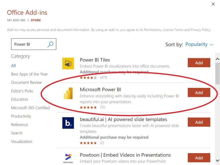
- In the resulting dialog, search for Power BI.
- Choose Microsoft Power BI, as shown in Figure A , and click OK. Downloading might take a few seconds.
Regardless of whether you used the Power BI button or the add-in, you’re now ready to link to the report. To do so, access the report online using Power BI mobile, paste its URL into the add-in control, as shown in Figure B , and click Insert. Allow a few seconds for this feature to link to the appropriate report.

Figure C shows the resulting report in a PowerPoint slide. During the show, you can filter the reports as if you were using Power BI mobile. In addition, the link is live, so as you update information via the data source, the link updates the reports in PowerPoint. To embed another report, you will need to download a new add-in frame or click the Power BI button via the PowerPoint interface.
You don’t have to start with PowerPoint. You can also share the report from Power BI mobile to PowerPoint.
How to share a Power BI report to Microsoft PowerPoint
If you prefer to start with Microsoft Power BI mobile, open the report and then use Share or Export. Both options offer a PowerPoint choice and end up displaying the dialog shown in Figure D .
After copying the link, open PowerPoint and insert the URL in a Power BI frame as you did above.

The difference with this route is that Export lets you embed the report as an image, which won’t update, or a live link, which will. Share lets you send a link to people via email or open the report in a new PowerPoint file.
Using either Export or Share you can bypass the add-in download task by clicking Open in PowerPoint ( Figure D ). Doing so opens a new .pptx file and imports the report into a slide without downloading the add-in frame first.
Sharing in Microsoft PowerPoint
Those with which you share the PowerPoint presentation will need an active Power BI account and access to the report to view the data in the presentation. Use the Share option to PowerPoint shown in the previous section.
Users without permission must request access to the report from its owner directly from inside the PowerPoint presentation.
Thanks to this new connection capability between Microsoft Power BI and Microsoft PowerPoint, you can share your data’s story in your PowerPoint presentations using existing Power BI reports. That link is live, so regardless of when you share that story, your reports will be up to date. For working efficiently, you can’t beat this combination.
Subscribe to the Developer Insider Newsletter
From the hottest programming languages to commentary on the Linux OS, get the developer and open source news and tips you need to know. Delivered Tuesdays and Thursdays
- Windows 11 cheat sheet: Everything you need to know
- Windows PowerToys: A cheat sheet
- Google Workspace vs. Microsoft 365: A side-by-side analysis w/checklist
- Best software for businesses and end users

Create a TechRepublic Account
Get the web's best business technology news, tutorials, reviews, trends, and analysis—in your inbox. Let's start with the basics.
* - indicates required fields
Sign in to TechRepublic
Lost your password? Request a new password
Reset Password
Please enter your email adress. You will receive an email message with instructions on how to reset your password.
Check your email for a password reset link. If you didn't receive an email don't forgot to check your spam folder, otherwise contact support .
Welcome. Tell us a little bit about you.
This will help us provide you with customized content.
Want to receive more TechRepublic news?
You're all set.
Thanks for signing up! Keep an eye out for a confirmation email from our team. To ensure any newsletters you subscribed to hit your inbox, make sure to add [email protected] to your contacts list.
- Courses Business Charts in Excel Excel Essentials for the Real World Fast Track to Power BI View all Courses
- For Business
- Power Excel
- Dashboards, Charts & Features
- VBA & Scripts
Create Business charts that grab attention AND auto-update. Wow your coworkers and managers with smart time-saving techniques.

Learn time-saving hacks to work smarter in Excel. Our members also consistently report a newfound enthusiasm for using Excel after taking our course.

Stay ahead of the game in 2024. Get access to our best-selling Power BI course now and become a highly sought-after Power BI professional. This course gets you started in Power BI – Fast!

Present Power BI Reports in PowerPoint
Building a super-cool Power BI dashboard with full interactivity (slicers, bookmarks, drill-through, etc.) can be quite satisfying.
But what do you do if you need to present this interactive dashboard in a meeting where PowerPoint is your only means of presentation?
Power BI does have a feature that allows you to export the screen as an image, but the image lacks all the wonderful interactivity. Plus, if you must give the presentation at a later date, you’ll need to update all the exported images because the data will likely have changed.
Hope is just around the corner.
Power BI released a feature that allows you to export the dashboard to PowerPoint while retaining most if not all the functionalities.
Let’s give a warm, XelPlus welcome to Embed Live Data .

Watch video tutorial
In this tutorial:
- Obtaining the Power BI Add-In for PowerPoint
- Testing Report Interactivity
- Adding a Power BI Report to an Existing Presentation
- Deeper Analysis During a Presentation
- Additional Presentation Features
- Sharing the Report
Working with the Power BI service online, we have a dashboard with the following interactive features:
- Slicers that allow us to filter by years
- Buttons that switch us between pages
- Slicers that allow us to select departments and channels

We want to export this dashboard to PowerPoint and retain interactivity.
Power BI now has an option behind the Export button called Embed Live Data .

When selected, we have the option to open the dashboard in PowerPoint with or without the current filter selections.

NOTE: As of this post’s publish date (July 2022), this feature was still in preview release. It has since become generally available with the March 2023 release .
Selecting the Open in PowerPoint option presents the following message.

Clicking the “ Trust this add-in ” will load the Power BI report into a PowerPoint slide.

Featured Course
Fast Track to Power BI

We need to take a step back and talk about obtaining the Power BI add-in for PowerPoint.
Before we can just drop a Power BI report into PowerPoint as easily as has been demonstrated, you need to first visit the Microsoft Store and download and install the Power BI add-in for PowerPoint.
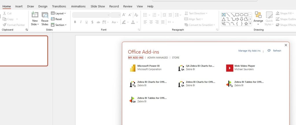
- Launch the Microsoft Office Add-Ins feature by selecting Insert (tab) -> Add-ins -> Get Add-ins .
- Search the Office Add-Ins for “ Power BI ”.

Once added to PowerPoint, you will see the add-in on the Insert ribbon.

Power Excel Bundle

By having the Power BI add-in as part of PowerPoint, we have full interactivity in our PowerPoint slide, both in Presentation Mode and standard Slide Design Mode.

Notice that the only page we have from our report was the page displayed when we performed the Embed Live Data action.
If you need other pages from the report, those pages will need to be inserted separately.
One workaround to this is to include a page navigation interface on the needed pages.

Buttons and bookmarks are fully operational.

Excel Essentials for the Real World

When working with an existing presentation, we can easily add a Power BI report by creating a new, blank slide and selecting Insert (tab) -> Power BI .
Our slide presents a placeholder that requests the link we saw earlier from the Power Bi service when we perform the initial export routine.
Click the Copy button to place the Power BI report link on the Clipboard.
Return to PowerPoint and paste the link in the placeholder and click Insert .

In addition to the report’s slicers and buttons working during the presentation, we can also leverage Power BI’s filter controls.

This embedded report is arguably superior to embedding Excel dashboards as Excel’s interactivity does not carry over to PowerPoint.

Capturing a Screenshot
If you need to capture a screenshot of the report during the presentation, click the arrow button in the upper-right corner and select Show as Saved image .

You can then right-click the report and copy it to the Clipboard for pasting it onto another slide or any other application.
To return to the interactive version of the report, click the arrow button in the upper-right corner and deselect Show as Saved image .
Report Options
In the lower-right corner reside controls for hiding the filter pane, refreshing the data, and resetting the report.

Changing the Report’s Story
Any changes made to the Power Bi report in the PowerPoint slide do not flow back to Power BI.
However, changes to the Power BI report at the source will flow down to PowerPoint when the slide link is refreshed.

Deleting a Report from a Slide
Clicking a Power BI report on a slide and pressing the Delete key will not remove the report from the slide.
To remove the report from the slide, click the arrow button in the upper-right corner and select Delete .

Hiding the Status Bar
If you don’t wish to display the bottom banner with the report add-in controls, click the down-arrow button in the lower-right of the report.

Viewing Report Status
The lower-left corner of the report displays the name of the Power BI report file as well as the date and time of the last refresh.

Clicking the report’s name will take you to the full report on the Power BI website.
If you share the report with an associate, the person with which you are sharing must have a Power BI account and have been granted access to the report and its underlying dataset.
The report and its data are not stored in the PowerPoint file, only a connection is created between PowerPoint and Power BI. The interactivity is displayed in real-time as the presentation is being used.
All security permissions are retained and respected.

Leila Gharani
I'm a 6x Microsoft MVP with over 15 years of experience implementing and professionals on Management Information Systems of different sizes and nature.
My background is Masters in Economics, Economist, Consultant, Oracle HFM Accounting Systems Expert, SAP BW Project Manager. My passion is teaching, experimenting and sharing. I am also addicted to learning and enjoy taking online courses on a variety of topics.
Need help deciding?
Find your ideal course with this quick quiz. Takes one minute.

Master Excel Power Query – Beginner to Pro
Featured tutorials.

Black Belt Excel Package

You might also like...

50 Power BI Interview Questions and Answers

Import Power BI Data into Excel

How to Add a Slicer in Power BI

EXCLUSIVE FREE NEWSLETTER
Join between the sheets.
Kickstart your week with our free newsletter covering Excel hacks, Power BI tips, and the latest in AI. You get to stay updated and get all the insights you need, delivered straight to your inbox.
You can unsubscribe anytime of course.
Stay Ahead with Weekly Insights!
Dive into Excel, AI and other essential tech news:
carefully crafted for the modern professional.
Success! Now check your email to confirm your subscription.
There was an error submitting your subscription. Please try again.
Discover our latest report Investment Banking Software 2024: Challenges, Trends and Strategies
4 effective ways of connecting Power BI to PowerPoint
- Efficiency Tips , How to guides , Power BI
More and more financial professionals have been adopting Power BI, the Microsoft software that is revolutionizing data analysis for decision-making. With Power BI, teams can access interactive online dashboards, also known as dynamic reports, that allow them to explore their company’s data securely.
Nevertheless, the use of static reports is still necessary when it comes to:
- Isolating specific information (removing confidential or irrelevant data)
- Analyzing, comparing or restoring data from a new angle
- Commenting on data
- Working on the formatting in new tables and graphs
- Sharing figures with people unfamiliar with Power BI
PowerPoint remains the best tool in the Microsoft Office suite for presentations and static reports, whether internal (ExCo, accounting, retrospective reviews, monitoring indicators, monthly follow-up, etc.) or external (investment reports, commercial proposals or activity reports).
In this article, we’ll explain four different methods to export Power BI to PowerPoint that will help you tell more dynamic stories with your data.
Discover the four main ways to connect Power BI to PowerPoint – and the limitations of each.
Microsoft’s native export, copy-pasting between Power BI and PowerPoint, or exporting Power BI via Excel all seem simple, but come with serious limitations.
UpSlide’s Power BI to PowerPoint Link, however, enables you to quickly access and import Power BI reports from within PowerPoint, and refresh the visual whenever data changes.
Option #1 – Native Microsoft export from Power BI to PowerPoint
As a Microsoft product, Power BI is compatible with the Office suite . Thanks to this, an easy way to export data is to use the native Export to PowerPoint function within Power BI online.
How to use Microsoft’s native PowerBI to PowerPoint export:
- Within PowerBI online, open a report published on one of your workspaces
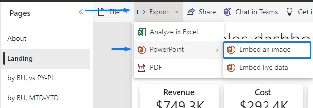
- On your report, click Export, then PowerPoint and choose whether you would like to export an image or embed the live data
- In the pop-up window, choose Current Values and then click on Export
- This will generate a PowerPoint file containing the pages of your report ready for you to download
Limitations of the native Power BI export:
The entire process takes place on Power BI online and forces you to cross-reference between the webpage and your PowerPoint presentation. This method generates a new PowerPoint file with the default neutral template, so the result will not comply with your graphic charter.
In addition, the pages of the Power BI report are converted into non-customizable images in a format that is often different to the PowerPoint template.
And finally, the data export process can be time-consuming.
Option #2 – Copy and paste a Power BI visual into PowerPoint
The second option to link from Power BI to PowerPoint is to copy and paste a visual from Power BI and paste it into PowerPoint. This is useful when you want to highlight some elements of a Power BI dashboard without downloading all the pages.
How to copy and paste Power BI visuals to PowerPoint:
- Open a PowerPoint file on your desktop
- Within Power BI online , open a report published on one of your workspaces
- In the popup window, click Copy to clipboard
- You can now return to your PowerPoint presentation and paste the visual on the slide of your choice
Limitations of copying and pasting Power BI visuals to PowerPoint:
Copy-pasting a static visual makes updating data a challenge. With this method, you can’t refresh the data from within PowerPoint and would have to return to Power BI and start the process over again whenever figures change. The visual remains an image accompanied by a text box detailing the “source” – this should be manually removed from your slide if you don’t need it.
Note : you can keep the hyperlink in the “notes” section to come back to this Power BI visual later.
Option #3 – Export Power BI data to PowerPoint via Excel
This third technique for linking Power BI to PowerPoint involves importing the Power BI data into Excel, where you can rework it before presenting it in PowerPoint.
It is sometimes necessary to export Power BI data to Excel for analysis or to create tables and graphs before inserting it into a PowerPoint presentation.
How to export your Power BI data to Excel and then PowerPoint:
- Within Power BI online, open a report published on one of your workspaces
- Select a visual, click on the “…” icon, then select Export data
- In the pop-up window, keep the default options (Summarized data and .xlsx file)
- Retrieve the raw data Excel file from your downloads
- Edit your table or chart in the Excel file, then link it to your PowerPoint presentation
Discover the quick and easy way to link Excel to PowerPoint >
Limitations of exporting Power BI data to Excel and PowerPoint:
Customizing the data in Excel before adding it to your PowerPoint can offer more flexibility than copy and paste. However, this technique is still time-consuming, and you must repeat the process each time your Power BI data evolves.
This last method does not allow you to filter or update your Power BI data from within PowerPoint.
Option #4 – UpSlide’s Power BI to PowerPoint Link
The advantages of upslide’s power bi to powerpoint link:.
UpSlide’s Power BI to PowerPoint Link is the easiest way to tell inspiring stories with your data. Access and import your Power BI reports directly from within PowerPoint without going through Power BI online. The link also allows you to export Power BI visuals to Word.
As your data changes over time, easily update one or more visuals in a few clicks using our Update Links button. Plus, you can edit the categorical slicer values for one or more visuals from a dedicated dropdown menu.
How to link Power BI to PowerPoint with UpSlide:
- Within the UpSlide ribbon in PowerPoint, click the Import Visual button
- Select a Power BI report from the pane that appears. Note: if this is your first export, you will have to log in to Power BI first
- Select your desired visual and click on the “…“ icon, then click Export to PowerPoint . If you want to export the full report, click directly on Export Page at the bottom of the window
Congratulations! You’ve successfully connected your Power BI report to your PowerPoint presentation.
Follow these steps to refresh your Power BI visuals directly from within your PowerPoint presentation:
- Within the UpSlide ribbon in PowerPoint, click the Update Links button
- In the pane that appears on the right, select the links you want to refresh
- Click on the Update button
- Just like that, you have updated the Power BI visuals in your presentation without leaving PowerPoint!
Want to narrow the dataset that applies to your visuals? You can also edit the categorical slicer values from within PowerPoint . Discover how >
To learn more about our Power BI to PowerPoint and Word Link, get in touch with a member of our team.
Which method will you use for your next Power BI to PowerPoint export?
Let us know by leaving a comment!
Efficiency Tips How to guides Power BI
- Efficiency Tips|How to guides|Power BI
The top four ways to export Power BI to Excel
Looking to export Power BI data to Excel? Explore our top four recommendations to improve...
- Efficiency Tips|Excel|How to guides|PowerPoint
How to link Excel to PowerPoint and save hours of time
Let’s explore efficient ways of linking Excel to PowerPoint—from native embedding to UpSlide’s dynamic link...
- Efficiency Tips|How to guides|Technology and AI
The 2024 guide to PowerPoint add ins
PowerPoint is the cornerstone of business communication, strategy, and collaboration, with most of us spending...
Find out how UpSlide could help you and your teams
- Document automation
- Brand compliance
- Reporting automation
- Content enablement
- Enterprise solution
- PowerPoint automation tool
- Excel automation tools
- Enterprise content management
- Implementation
- Design studio
- Investment banking
- Asset management
- Private equity
- Financial reporting
- UpSlide vs Templafy
- UpSlide vs Macabacus
- Excel to PowerPoint Link
- Content Library
- Slide Check
- PowerPoint Formatting Features
- Power BI to PowerPoint Link
- Template Management
- Excel Charts
- Outlook Signature Manager
- Logo Finder
- Knowledge hub
- Help center
- UpSlide Portal
- ROI calculator
- Sustainability
- Subscribe to our newsletter
- Legal terms
- User information
- © 2022-2024 UpSlide. All rights reserved.
- User informations
- FInancial reporting
Knowledge Base Zebra BI for Power BI
- Zebra BI Knowledge Base
- Zebra BI for Power BI
- Sharing and Publishing
Exporting Power BI reports to PowerPoint slides
Table of Contents
- Export a Power BI report to PowerPoint
- Embedding live Power BI report page into PowerPoint
- Embedding a live visual on a PowerPoint slide
- Insert a report or visual URL into the add-in
While Power BI is an excellent tool for creating business reports, there is another option when you want to present these reports in an especially memorable way. Luckily, for the certified visuals, Microsoft enables embedding Power BI reports into MS PowerPoint. You can do so in just a few clicks.
Export a Power BI report to PowerPoint #
1. Log into your Power BI account, select the report you want to export, and click Export > PowerPoint.
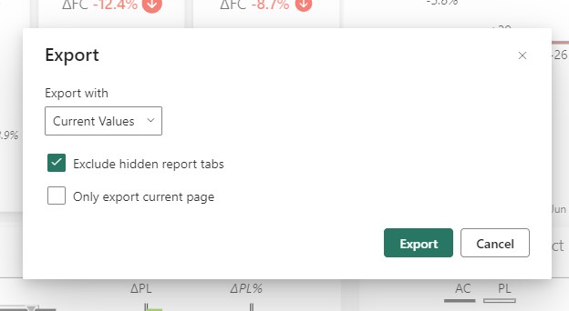
You will be prompted with multiple choices about your export. Here you can customize values, decide if you want your file to include hidden report tabs, and, if you are interested in only one particular page, export only the page you are currently on .
2. A notification should appear about the exporting process. Once it is done, the PPTX file will begin to download. Open the file after it’s finished.

3. Open your newly created PowerPoint document and click on Enable Editing to finalize your presentation.
This feature was enabled after Microsoft officially certified Zebra BI custom visuals for Power BI. Find more details about exporting your report pages to MS PowerPoint .
Watch how to export your reports into PowerPoint in just a few clicks.
How to embed Power BI in updatable PowerPoint slides?
There are, at the moment, some limitations to this feature, for example:
- It is only available in the Power BI service (you cannot do it from the Power BI Desktop).
- Exported PowerPoint slides are static pictures (you cannot refresh them in PowerPoint).
- You can only export one Power BI report at a time.
- The number of pages is limited (only the first 30 pages will be exported).
- Only certified custom visuals are supported.
- Python visuals, R visuals, and ArcGIS visuals are not supported.
The fact that PowerPoint slides cannot be refreshed and that you cannot create a PowerPoint slide deck from selected report pages from several different reports makes the Export to PowerPoint feature unfit for typical business use cases.
Embedding live Power BI report page into PowerPoint #
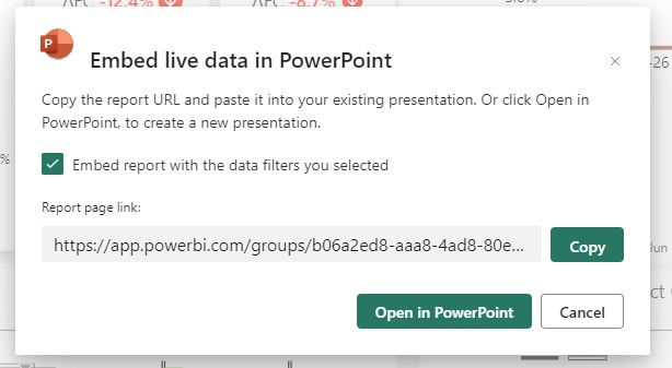
The export option offers a second choice of embedding the live data directly on a PowerPoint slide.
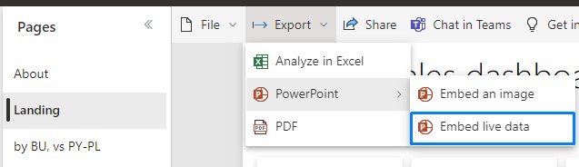
When this option is selected an additional window opens where you will get the URL of the report page. Copy the URL to paste into the Power BI PowerPoint add-in. Alternatively, if you want to create a new presentation with the report already loaded into the add-in, choose Open in PowerPoint .
Embedding a live visual on a PowerPoint slide #
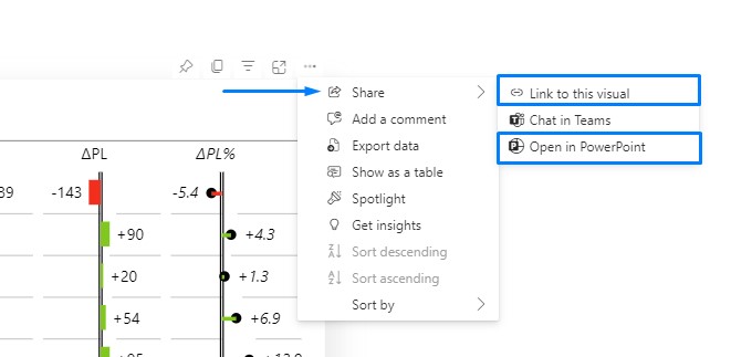
A live visuals URL is required if you wish to use it in your presentation. Following are the simple steps to obtain a visual’s URL.
- Open the report to the page that contains the desired visual in the Power BI service. Use filters, selection, slicers, and other configuration options to set the visual up as needed.
- Go to More options (…) and: – Hover over Share and choose Link to this visual to get the visual’s URL, if you’re adding the visual to an existing presentation. After you’ve copied it, paste it into the Power BI PowerPoint add-in . – When you want to open a new presentation with the visual already loaded into the add-in, choose Open in PowerPoint .
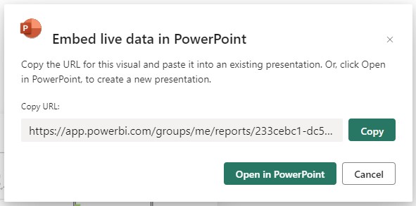
Select Open in PowerPoint from the Embed live data in PowerPoint dialogue that displays. With the visual already loaded into the add-in, this launches a fresh PowerPoint presentation.
Insert a report or visual URL into the add-in #
- Open a PowerPoint file and find the slide on which you wish to add the report or visual.
- Go to the Home tab and click on the Add-ins button. When clicked, a dropdown menu appears with all your existing Add-ins and an option to browse for new Add-ins -> Get Add-ins
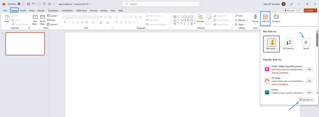
By clicking on See all you will be able to see the whole set of your saved add-ins
Select Microsoft Power BI add-in and insert the link you copied from the report or visual in the Power BI Service
The report or visual is live after it has loaded, and you may choose the data you want to use. Your changes will be saved as you make them while editing the presentation. The report or visual will reopen in the same state as when you last closed the presentation.
Was this article helpful?
Export your Power BI reports as PDF documents
Email subscriptions – send automated emails to your end-users.
Microsoft Power BI Blog
- Announcements
Presentation mode in Power BI Windows App

Many organizations are embracing data culture and using business, sales, operations and other types of data in meetings and decision-making processes. Power BI apps support that, and today we’re releasing enhanced presentation mode capabilities in Power BI Windows 10 app, built specifically for such scenarios.
Using Presentation mode in the Power BI app running on Surface Hub in your conference room and collaboration areas, better allows you to have meetings which focus on your data. Presenting, collaborating and having productive discussions with your colleagues and team members while using your data in your Power BI dashboards and reports has never been easier.
To enter Presentation Mode, tap the full screen button in the menu bar. This will make the app frame disappear, allowing you to put all your attention on the report or dashboard visuals and data.
Depending on your screen size, a new action bar will be shown, either on the bottom of the screen (for up to 84” displays) or on the left and right edges (for 84” and larger displays).

The action bar has tools for helping you navigate within the report (pages) and inside the app (breadcrumbs). The tools also help you find other content within the reports (search), and help you enhance your presentations and team discussions (inking).
If you have a pen, you can use inking to highlight items during your presentation and add annotations to the report based on discussions during the meeting:

The actions bar can also be undocked and be placed anywhere on your screen. This is extremely useful if you have large screen and you want the actions close to a specific visual as you’re discussing or presenting it:

You can still enjoy presentation mode even if you don’t have Surface Hub in your meeting room. Presentation mode is also available for Windows desktops, laptops and tablets . You can also use the same functionality while projecting Power BI data on your screen in the conference room or while sharing your screen during online meetings, for example, when using Teams or Skype.
- Collaboration
- Power BI App
- Surface Hub
- Windows App
กรุณาเข้าสู่ระบบหรือสมัครสมาชิกเพื่อดำเนินการต่อ
หากคุณยังไม่มีบัญชีผู้ใช้ กรุณาสมัครบัญชีผู้ใช้และเข้าสู่ระบบ

15 Days of PowerBI - Complete Microsoft PowerBI Bootcamp by Ligency
สามารถเรียนที่ไหน เมื่อไหร่ก็ได้ตลอดชีพ
เนื้อหาทั้งหมด 129 วิดีโอ ความยาวรวมกัน 10 ชั่วโมง 55 นาที
มีไฟล์ให้ดาวน์โหลด
แบบทดสอบทั้งหมด 1 แบบทดสอบ
เรียนรู้การใช้งานโปรแกรม Microsoft PowerBI ในการสร้าง Visualization และ Data Analytics ให้ตอบโจทย์การทำงาน
แนวทางและเทคนิคในการวิเคราะห์ข้อมูลและการแสดงภาพ เพื่อแปลงข้อมูลดิบให้เป็นข้อมูลเชิงลึกได้อย่างมีประสิทธิภาพ

4.8 คะแนนเฉลี่ย
1,469 รีวิว
- สถาบันสอนด้านการสร้าง Presentation และ Data Visualization อันดับ 1 ของประเทศไทย

- ปัจจุบัน: อาจารย์ประจำมหาวิทยาลัย มีความรู้ความเชี่ยวชาญในการวิเคราะห์ข้อมูลและการวิจัยข้อมูล
- ผู้แต่งหนังสือ:
- 1) การวิเคราะห์ข้อมูลเชิงภาพด้วย Power BI
- 2) การใช้นิพจน์วิเคราะห์ข้อมูล DAX
- 3) การจัดการข้อมูลเพื่อการวิเคราะห์ Power Query
คอร์สที่เกี่ยวข้อง
พูดอย่างไรให้ ปัง ดัง โดนใจ, พูดด้วยภาพ พรีเซนต์อย่างไรให้ถูกใจคนฟัง, managing emotion มีความสุขได้ ถ้าจัดการอารมณ์ตัวเองเป็น, virtual presentation & communication canvas พูดและนำเสนอออนไลน์แบบมือโปร.
ปลดล็อคศักยภาพการทำงานด้วย OKRs (Unlocking Performance with OKRs)
ไม่พบอีเมลในบัญชีผู้ใช้งานนี้
พบว่ามีการเข้าสู่ระบบด้วยเลขประจำตัวประชาชน กรุณาตั้งค่าอีเมลสำหรับบัญชีผู้ใช้งานนี้เพื่อดำเนินการต่อ หรือออกจาก ระบบหากไม่ใช่เลขประจำตัวประชาชนของคุณ
- วิธีการชำระเงิน
พัฒนาทักษะการวิเคราะห์ข้อมูลและการแสดงภาพ ในการนำเสนอข้อมูลเชิงลึกอย่างมีประสิทธิภาพผ่านการใช้โปรแกรม Microsoft PowerBI
คำอธิบายคอร์สออนไลน์ คอร์ส "15 Days of PowerBI - Complete Microsoft PowerBI Bootcamp by Ligency" คอร์สนี้จะเน้นการฝึกฝนและพัฒนาทักษะการใช้งานโปรแกรม Microsoft PowerBI ซึ่งเป็นเครื่องมือชั้นนำในการสร้าง Visualization และ Data Analytics ได้ตอบโจทย์กับการทำงานหลากหลายรูปแบบ จากหลักสูตรลิขสิทธิ์ของ Ligency บริษัท eLearning ชั้นนำ ด้าน Data และ Business Intelligence ที่จะให้ผู้เรียน ได้เรียนรู้ข้อมูลเบื้องต้นที่ครอบคลุมเกี่ยวกับการวิเคราะห์ข้อมูลและการแสดงภาพ เพื่อให้คุณมีทักษะในการแปลงข้อมูลดิบให้เป็นข้อมูลเชิงลึกที่นำไปปฏิบัติได้ ไม่ว่าคุณจะเป็นมือใหม่หรือต้องการฝึกฝนทักษะอย่างสม่ำเสมอ ห้ามพลาดกับหลักสูตรนี้
ประโยชน์ที่ผู้เรียนจะได้รับ - เรียนรู้พื้นฐานของโปรแกรม PowerBI และองค์ประกอบต่าง ๆ ที่สำคัญ - เข้าใจในตัวโปรแกรม PowerBI รู้เทคนิคและ Function ต่าง ๆ ตลอดจนสามารถใช้งานโปรแกรมได้อย่างคล่องแคล่ว - สามารถนำเข้า Data ทำ Data Cleaning หรือ Transform Data ให้พร้อมสำหรับการวิเคราะห์ - สามารถสร้างรายงาน หรือ Dashboard เพื่อแสดงผลลัพธ์ของ Data ให้ตอบโจทย์กับการทำงาน - แบ่งปัน และเผยแพร่ Data Insight ให้เกิดการทำงานและแลกเปลี่ยนข้อมูลร่วมกันได้
ใครควรเรียนคอร์สออนไลน์นี้ - ผู้เชี่ยวชาญด้านธุรกิจที่ต้องการพัฒนาทักษะการวิเคราะห์ข้อมูล - Data หรือ Business Analyst ที่ต้องการใช้งาน PowerBI เพื่อจัดการ Data Insight ให้ดีขึ้น - Managers หรือ Team Leaders ที่ต้องตัดสินใจด้วยการอาศัยข้อมูล - บุคคลทั่วไปที่มีความต้องการเรียนรู้และใช้งานโปรแกรม PowerBI ได้
ผู้เรียนต้องมีความรู้อะไรมาก่อน ไม่จำเป็นต้องมีความด้านใดมาก่อน ก็สามารถเรียนได้อย่างเข้าใจ
อ่านทั้งหมด

Effective Team Communication Skills สื่อสารกับทีมให้ได้ทั้งใจและได้ทั้งงานที่ประสิทธิภาพสูง
Amplify your hybrid team’s success ปั้นไฮบริดทีมอย่างไร ให้ผลงานปัง, the art of management for smart supervisor ศิลปะการบริหาร เพื่อการเป็นสุดยอดหัวหน้างาน, คุณยืนยันการลงทะเบียนเรียนใหม่หรือไม่, กรุณากดยืนยันเพื่อชำระเงินในการลงทะเบียนเรียนใหม่ หากคุณดำเนินการลงทะเบียนเรียนใหม่แล้ว ระบบจะทำการยกเลิกเกรดก่อนหน้านั้นโดยทันที.
สถาบันออนไลน์ สำหรับคนที่ต้องการความก้าวหน้า สอนโดยผู้เชี่ยวชาญ จากประสบการณ์จริง © 2024 SkillLane.com All rights reserved. นโยบายคุ้มครองข้อมูลส่วนบุคคล
การแจ้งเตือน
This browser is no longer supported.
Upgrade to Microsoft Edge to take advantage of the latest features, security updates, and technical support.
View reports and dashboards in presentation mode on Windows devices
- 9 contributors
The Power BI Windows app was retired on December 31st, 2023, and is no longer supported. It's been removed from the Microsoft apps store, and no further product updates for it will be released. Please use the Power BI service to view your Power BI content on Windows devices.
This notice only applies to the Power BI Windows app. It does not affect the Power BI Desktop app.
You can use presentation mode to display reports and dashboards in full-screen on Windows devices. Presentation mode is useful for displaying Power BI at meetings or conferences, or on a dedicated projector at the office, or even just for maximizing space on a small screen.

In presentation mode:
- All the "chrome" (such as the navigation and menu bars) disappears, making it easier to focus on the data in your report.
- An action toolbar becomes available to enable you to interact with your data and to control the presentation.
- You can play a slideshow that cycles automatically between pages, bookmarks, or both pages and bookmarks.
Use presentation mode
From the toolbar you can tap to perform the following actions:
| Icon | Action |
|---|---|
| to the previous page. A long tap on the icon pops up the breadcrumbs windows, allowing you to navigate to the folder containing your report or dashboard. | |
| to another page of the report in your presentation. | |
| to present the particular view of your data that that bookmark captures. You can apply both personal and report bookmarks. | |
| when you use your Surface pen to draw and annotate on your report page. | |
| you might have made with the Surface pen to draw and annotate on your report page. | |
| and clear any filters, slicers, or any other data view changes you might have made during the presentation. | |
| an image of the presentation view with your colleagues. The image will include any annotations you have made with the Surface pen during the presentation. | |
| the report. | |
| , hiding the action bar and starting the slideshow. A selector allows you to choose to auto-rotate between pages, bookmarks, or both pages and bookmarks. By default the slideshow auto-rotates between pages once every 30 seconds. You can change these settings in . See about slideshows | |
| presentation mode. | |
| for other artifacts in Power BI. |
You can undock the toolbar and drag and drop it to anywhere on the screen. This is useful for large screens, when you want to focus on a specific area in your report and want to have the tools available next to it. Just place your finger on the toolbar and swipe it into the report canvas.

You can play a slideshow to automatically cycle through your presentation. You can set the slideshow to cycle through pages, bookmarks, or both pages and bookmarks. During the slideshow, report pages with auto page refresh will continue to automatically refresh as configured, ensuring that the most current data is always shown.
When you select the Play button on the action toolbar, the slideshow begins. A controller appears that allows you to pause the slideshow or to change what's being played: pages, bookmarks, or both pages and bookmarks.

The controller shows the name of the currently displayed view (page or bookmark and page). In the image above, we see that in the report called Sales , we are currently viewing the Asia Pacific bookmark on the Sales Performance page.
By default, a slideshow cycles through pages only, at a rate of one every 30 seconds. You can change the default behavior in the Slideshow settings .
Auto play a slideshow on startup
You can set up the Power BI Windows app to start playing a slideshow automatically whenever the app is launched. This option is useful for creating a kiosk-like experience that runs a report in public displays without any manual intervention. See Slideshow settings for detail about setting up a report for autoplay.
Slideshow settings
By default, a slideshow cycles through pages only, at a rate of one every 30 seconds. You can change this default behavior by going to Settings > Options , as illustrated below. You can also turn on autoplay and choose a report to play.
Select the settings icon.
Open the options page.
If desired, change the default settings for what the slideshow will cycle over (pages, bookmarks, or both) and how frequently the slides will transition.
If you want your report to start playing automatically when the app is launched, turn on the toggle and choose Select Report . You will be able to search for reports you have access to.

Related content
- Display dashboards and reports in full-screen mode from the Power BI service
- Questions? Try asking the Power BI Community
Was this page helpful?
Additional resources
IMAGES
VIDEO
COMMENTS
As soon as you add a live Power BI report page or visual to PowerPoint, you can start interacting with your data just as you would in Power BI. The initial view is determined by the URL you used. The following image shows a report page loaded into the add-in, with the add-in features labeled. The same add-in features are available when you load ...
Export your Power BI report to PowerPoint. In the Power BI service, select a report to display it on the canvas.Then, select Export > PowerPoint from the menu bar.. In the Export to PowerPoint dialog that appears, choose Export as image, and then choose the other options as desired.. Current values exports the report in the current state. This includes the active changes you made to slicer and ...
Add individual visuals and whole report pages to your PowerPoint slides with the Power BI add-in or create a new PowerPoint presentation with live data from the Power BI Service. With the Power BI add-in, you can also use recommended content from the add-in to use on an existing slide. You also insert a direct URL link into the Power BI add-in.
Stop cropping Power BI screenshots to include in a PowerPoint presentation! Now you can export the entire Power BI report to a PowerPoint file. With export, you'll get: Each report page as a PowerPoint slide; Each Power BI visualization in the report as a high-resolution image in PowerPoint (just resize as you wish)
Power BI and PowerPoint are now better together than ever before. We're excited to announce the general availability of the Power BI integration with PowerPoint, which brings the world's most powerful data visualization tool to the world's most popular presentation program. The value of this integration is clear: it lets people easily add interactive Power BI data visualizations to their ...
Exporting a Power BI report to PowerPoint is a good way of integrating these two tools together. The analytical power of Power BI combined with the commentary and presentation features of PowerPoint enables you to present your reports differently. You can export almost any Power BI report (limitations mentioned in this post) to PowerPoint, and…
Step 2: Export Your Report to PowerPoint. To easily export your Power BI report to PowerPoint, follow these steps: Open the Power BI report that you want to export. In the Power BI toolbar, click on the "File" tab. From the dropdown menu, select "Export" and then choose "PowerPoint".
We're thrilled to be shipping Power BI Data storytelling that lets you add Power BI reports and bookmarks to your slides and enjoy the delightful interactive experience of Power BI inside your presentations. With data storytelling, data will always be up to date in your slides, whether you're building a presentation or presenting it live to others.
Open a new or existing presentation in PowerPoint. To insert a Power BI report in the current slide, select Insert > Power BI. NOTE: If you don't see the Power BI button in the ribbon, you can get the add-in from the Microsoft App Store. Copy the link to the Power BI report you want to insert, paste it into the Paste report page URL here box ...
Click the button to add a frame and start the process. If you don't find that button, download Power BI as follows: Click the Insert tab. In the Add-ins group, click Get Add-ins. In the ...
Before we can just drop a Power BI report into PowerPoint as easily as has been demonstrated, you need to first visit the Microsoft Store and download and install the Power BI add-in for PowerPoint. Launch the Microsoft Office Add-Ins feature by selecting Insert (tab) -> Add-ins -> Get Add-ins. Search the Office Add-Ins for " Power BI ".
With the Power BI add-in for PowerPoint, you can enhance your data storytelling in PowerPoint with live, interactive Power BI data. Not only will the data shown in your presentations be always up to date, but also, while you're presenting, you'll be able to filter and drill down on data in response to questions and feedback from your audience ...
Table of Contents hide. 1 Option #1 - Native Microsoft export from Power BI to PowerPoint. 2 Option #2 - Copy and paste a Power BI visual into PowerPoint. 3 Option #3 - Export Power BI data to PowerPoint via Excel. 4 Option #4 - UpSlide's Power BI to PowerPoint Link.
The process of embedding Power BI visuals in PowerPoint is straightforward and easy to follow. Here are the steps you need to take: Step 1: Open the Power BI report you want to embed in PowerPoint. Step 2: Click on the "File" menu and select "Embed in SharePoint Online or Webpage.". Step 3: Choose the visual you want to embed and ...
Export a Power BI report to PowerPoint #. 1. Log into your Power BI account, select the report you want to export, and click Export > PowerPoint. You will be prompted with multiple choices about your export. Here you can customize values, decide if you want your file to include hidden report tabs, and, if you are interested in only one ...
With this new automatic refresh in slide show feature, you can now set the add-in to automatically pull fresh data from Power BI while the presentation is in slide show mode, ensuring that your presentation always shows the most recent data. To set up automatic refresh for your slide show, go to the add-in footer, select Add-in options, choose ...
Using Presentation mode in the Power BI app running on Surface Hub in your conference room and collaboration areas, better allows you to have meetings which focus on your data. Presenting, collaborating and having productive discussions with your colleagues and team members while using your data in your Power BI dashboards and reports has never been easier with the enhanced Presentation mode ...
The Power BI add-in for PowerPoint enables users to add live, interactive data from Power BI to PowerPoint presentations. Currently, users can add individual report pages and individual visuals. When a report page is added, the add-in doesn't bring in the left hand navigation pane, but any page navigation visuals on the report page itself will ...
1) การวิเคราะห์ข้อมูลเชิงภาพด้วย Power BI 2) การใช้นิพจน์วิเคราะห์ข้อมูล DAX 3) การจัดการข้อมูลเพื่อการวิเคราะห์ Power Query
Use presentation mode. In the Power BI Windows app, tap the Switch to presentation mode icon. The app chrome disappears and the action toolbar appears at the bottom of the screen or on the right and left sides (depending on your screen size). From the toolbar you can tap to perform the following actions: Go back to the previous page.